Dashi Egg Sand Packaging by Yuta Takahashi |
Home > Winners > #121213 |
 |
|
||||
| DESIGN DETAILS | |||||
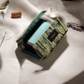
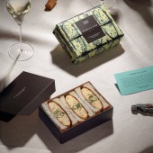
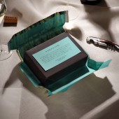
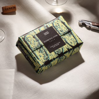
| DESIGN NAME: Dashi Egg Sand PRIMARY FUNCTION: Packaging INSPIRATION: This design was born from the idea of how to express the goodness of the contents in the package. The wrapping paper has the illustration of a Sandwich's cross-section. The illustration expresses softness, the ready-made and handmade feel of the Sandwich, venturing to leave an impression of roughness. In addition, the gentle wrapping paper is also linked to the process of cooking the Japanese Omelette. The consumer can then imagine the contents and the chef from the package. UNIQUE PROPERTIES / PROJECT DESCRIPTION: A package design used for Japanese Omelette Sandwich meant for takeout. The soft wrapping paper and the illustrations on it are reminiscent of the gentle taste and texture of food. The moment one opens the package, it becomes a piece of tableware that displays the dish. The package has been enhanced from mere food container to a tool that enriches the eating space in order to immerse oneself in the food experience from the moment the product is first seen to the moment one is done eating. OPERATION / FLOW / INTERACTION: Designed to facilitate cooking and communication. When the wrapping paper, which gives the impression of softly enveloping the dish, is opened, a first look reveals the contrast between the bright blue claire printed on the back and the dark brown of the box. Its form brings parties and picnics to mind. It has been thought up with improving the act in mind of having a special and enjoyable meal, rather than reluctantly filling the hunger. PROJECT DURATION AND LOCATION: This project started in June 2020 in Iyo Saijo City, Ehime Prefecture, Japan, and ended in December 2020. Package production began in December 2020 and ended in January 2021. The product has been on sale since February 2021. FITS BEST INTO CATEGORY: Packaging Design |
PRODUCTION / REALIZATION TECHNOLOGY: The ink is an original mix, expressing the color of eggs, secret sauce, and ocean blue, the color for the client's store. The box is made of unbleached kraft paper with water and oil resistant processing that doesn't use plastic or film materials, aiming to reduce its environmental impact. The package includes many items such as wrapping paper, message cards, lids, the boxes themselves, and two stickers, but the selection and processing of materials have resulted in an amazing cost performance. SPECIFICATIONS / TECHNICAL PROPERTIES: Wrapping paper: 366.7mm x 222.3mm Front sticker: 76.2mm x 63.5mm Side sticker: 88.9mm x 15.9mm Card: 139.7mm x 69.9mm Box: 165.1mm x 114.3mm x 48.2mm TAGS: Branding, Packaging, Wrapping paper, Box, Sandwich, Abstract, Pattern, Japan RESEARCH ABSTRACT: All sorts of takeaway food containers from the market were surveyed. He took the container and had dining experiences with them. He realized then that the main function of the takeout package was putting the product inside and taking it home; the function of experiencing an impression of the food was omitted. The taste of a dish can change depending on the plate. As COVID-19 has increased takeout consumption, he felt the need for a package that would ensure meals weren't simply consumed. CHALLENGE: The necessary elements for an aesthetic culinary experience can also be thought of in takeout food. From the moment one looks at the package, they can image an impression, texture, tenderness, and taste of the dish. They're conscious of designs that improve the value of the dish and gives them a sense of excitement. In popular cooking packages, the pursuit of cost performance was also an important research factor. ADDED DATE: 2021-02-27 05:16:16 TEAM MEMBERS (4) : Art Director: Yuta Takahashi, Designer: Yuta Takahashi, Assistant: Miyuki Hino and Photographer: Yuta Takahashi IMAGE CREDITS: Image 1: Photographer Yuta Takahashi, 2021 Optional Image 1: Photographer Yuta Takahashi, 2021 Optional Image 2: Photographer Yuta Takahashi, 2021 Optional Image 3: Photographer Yuta Takahashi, 2021 Optional Image 4: Photographer Yuta Takahashi, 2021 |
||||
| Visit the following page to learn more: http://yutatakahashi.jp | |||||
| AWARD DETAILS | |
 |
Dashi Egg Sand Packaging by Yuta Takahashi is Winner in Packaging Design Category, 2020 - 2021.· Press Members: Login or Register to request an exclusive interview with Yuta Takahashi. · Click here to register inorder to view the profile and other works by Yuta Takahashi. |
| SOCIAL |
| + Add to Likes / Favorites | Send to My Email | Comment | Testimonials | View Press-Release | Press Kit |

