Public Health Beyond Borders Visual Identity Program by Yoske Mitsui |
Home > Winners > #121047 |
 |
|
||||
| DESIGN DETAILS | |||||
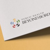
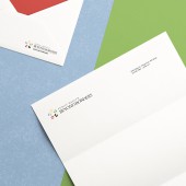
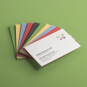
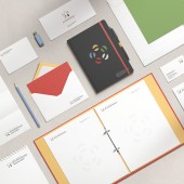
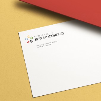
| DESIGN NAME: Public Health Beyond Borders PRIMARY FUNCTION: Visual Identity Program INSPIRATION: The green and blue reflect their "think global, act global" mindset. The red, yellow and black reflect University of Maryland origins and their founding chapter. The circle in the middle of the colors represents unity and their global mindset while emphasizing the importance of partnerships and relationships to their organization. UNIQUE PROPERTIES / PROJECT DESCRIPTION: Public Health Beyond Borders (PHBB) consists of a globally minded group of students and faculty from University of Maryland aiming to address health needs in partnering communities. Yoske Mitsui was assigned to create the visual identity program and develop brand identity specifications including the appropriate colors, typography for both print and digital media, stationery and merchandise. OPERATION / FLOW / INTERACTION: The logo is simple enough to work in a variety of sizes and media, also works in the version of the one-color. Appropriate in form and their concept "think global, act global" mindset. PROJECT DURATION AND LOCATION: The project started in October 2020 in Maryland and finished in February 2021. (All the process has been remotely) FITS BEST INTO CATEGORY: Graphics, Illustration and Visual Communication Design |
PRODUCTION / REALIZATION TECHNOLOGY: The previous logo was very complicated and was not related their organization's concept and it needed to include something relate to the University of Maryland identity. My mainly approach to the visual identity program are 1. Appropriate for an international public health organization (credible, global, clean and safe) 2. Scalable, flexible and modular (includes a symbol that can be detached and can come to represent the brand with consistent use over time) 3. Enables lockups with sponsorships and other partners 4. Timeless, distinctive and simple SPECIFICATIONS / TECHNICAL PROPERTIES: The five colors reflect their "think global, act global" mindset and University of Maryland origins and their founding chapter. The wordmark is also visually matched up with University of Maryland's primary typefaces. TAGS: Visual Identity, Logo, Logo Design, Branding, Public Health, Typography, Graphic, Graphic Design, Communication Design RESEARCH ABSTRACT: - CHALLENGE: - ADDED DATE: 2021-02-26 17:02:41 TEAM MEMBERS (1) : IMAGE CREDITS: Yoske Mitsui, 2020. |
||||
| Visit the following page to learn more: https://yoskemitsui.com/phbb | |||||
| AWARD DETAILS | |
 |
Public Health Beyond Borders Visual Identity Program by Yoske Mitsui is Winner in Graphics, Illustration and Visual Communication Design Category, 2020 - 2021.· Press Members: Login or Register to request an exclusive interview with Yoske Mitsui. · Click here to register inorder to view the profile and other works by Yoske Mitsui. |
| SOCIAL |
| + Add to Likes / Favorites | Send to My Email | Comment | Testimonials | View Press-Release | Press Kit |

