Heheqingtian Tea Brand Identity by Zi Huai Shen |
Home > Winners > #121025 |
 |
|
||||
| DESIGN DETAILS | |||||
| DESIGN NAME: Heheqingtian PRIMARY FUNCTION: Tea Brand Identity INSPIRATION: Heheqingtian starts from the concept of Convergence. Zi Huai Shen combine the door shape of building and the Chinese character HE to integrate the spirit of serving tea into its identity image to highlight the implication of assemble together, outward expanding to create new look of Heheqingtian. UNIQUE PROPERTIES / PROJECT DESCRIPTION: Heheqingtian is a brand which is reborn from a private Japanese-style dwelling to promote tea living and cultural experience space. It combine diversified fields to jointly explore the beauty of tea from various dimensions and to build the culture hall of tea and the world. OPERATION / FLOW / INTERACTION: The Chinese character HE to integrate the spirit of serving tea into its identity image to highlight the implication of assemble together, outward-expanding as the overall planning concept, and uses contracted design to convey the simple atmosphere of leisurely tasting tea. PROJECT DURATION AND LOCATION: The project started in Sep 2017 in Taiwan and finished in Mar 2019 in Taiwan. FITS BEST INTO CATEGORY: Graphics, Illustration and Visual Communication Design |
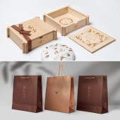
PRODUCTION / REALIZATION TECHNOLOGY: Wooden, tenon-and-mortise structure, no glue, environmentally friendly. The tea box material uses Wooden, which implements the environmental protection and green design concept. SPECIFICATIONS / TECHNICAL PROPERTIES: Wooden Box. 140mm x 140mm x 40mm Paper. 210mm x 297mm x 130mm TAGS: Branding design, Package design, Traditional culture, Asian design RESEARCH ABSTRACT: Heheqingtian is a brand which is reborn from a private Japanese-style dwelling to promote tea living and cultural experience space. It combine diversified fields to jointly explore the beauty of tea from various dimensions and to build the culture hall of tea and the world. CHALLENGE: The tenon-and-mortise structure of the tea box, such a structure does not require any glue bonding and is very environmentally friendly. ADDED DATE: 2021-02-26 15:53:30 TEAM MEMBERS (1) : Creative Director : Zi Huai Shen IMAGE CREDITS: Designer Zi Huai Shen, Photographer Yu Hsuan Liu, 2019 PATENTS/COPYRIGHTS: Copyrights belong to SUMP DESIGN / Heheqingtian |
||||
| Visit the following page to learn more: https://www.hehe-qingtian.com | |||||
| AWARD DETAILS | |
 |
Heheqingtian Tea Brand Identity by Zi Huai Shen is Winner in Graphics, Illustration and Visual Communication Design Category, 2020 - 2021.· Read the interview with designer Zi Huai Shen for design Heheqingtian here.· Press Members: Login or Register to request an exclusive interview with Zi Huai Shen. · Click here to register inorder to view the profile and other works by Zi Huai Shen. |
| SOCIAL |
| + Add to Likes / Favorites | Send to My Email | Comment | Testimonials | View Press-Release | Press Kit |
| COMMENTS | ||||||||||||||||||||
|
||||||||||||||||||||
Did you like Zi Huai Shen's Graphic Design?
You will most likely enjoy other award winning graphic design as well.
Click here to view more Award Winning Graphic Design.


