Solemici Packaging Packaging Concept by Dmitry Kultygin |
Home > Winners > #120913 |
 |
|
||||
| DESIGN DETAILS | |||||
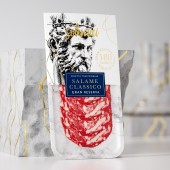
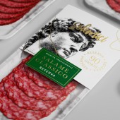
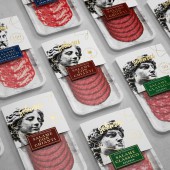
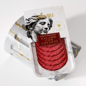
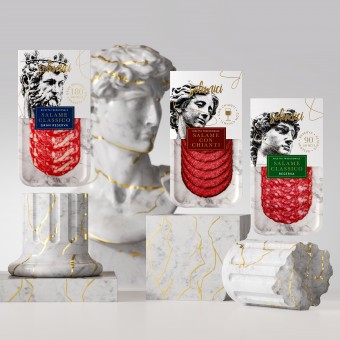
| DESIGN NAME: Solemici Packaging PRIMARY FUNCTION: Packaging Concept INSPIRATION: Italy has made a huge contribution to world culture. During the Renaissance, the greatest masterpieces were created by such masters as Michelangelo, Bernini and many others. The Italians turn everything into art. Even meat delicacies are a masterpiece to be delighted — delighted for their taste. UNIQUE PROPERTIES / PROJECT DESCRIPTION: The unique design emphasizes the attentive attitude of the manufacturer to the product and respect for the traditions of production. Bright packaging and contrasting details distinguish the product on the shelf among competitors. The use of gold foil stamping enhances the premium character of the product. All this makes the product more attractive to consumers and helps them make a purchase decision faster. OPERATION / FLOW / INTERACTION: Interaction with the end customer takes place on the store shelf. An interesting metaphor of comparing the taste of meat delicacies with masterpieces of art allows the consumer to make the right choice. PROJECT DURATION AND LOCATION: The project started in December 2020 in Moscow FITS BEST INTO CATEGORY: Packaging Design |
PRODUCTION / REALIZATION TECHNOLOGY: The main packaging is a plastic tray with marble texture printing. The paper header is printed using offset printing and gold foil stamping. SPECIFICATIONS / TECHNICAL PROPERTIES: Plastic tray size: height - 225 mm, width - 123 mm. Paper header size: height - 110 mm, width - 128 mm. TAGS: Salame, Meat Delicacies, Renaissance, Italy, Packaging, Branding RESEARCH ABSTRACT: The main task in the development of the design was to find a metaphor that is understandable to the consumer. The comparison of meat delicacies with masterpieces of Renaissance art allowed us to show the superiority of the product over its competitors and to emphasize the rich traditions of Italy in the production of salami, prosciutto and other delicacies. CHALLENGE: The packaging was supposed to convey the quality and reliability of the brand, inspire consumers to buy. First of all, it was necessary to find effective design elements that would speak about the taste and quality of the product, emphasize the attentive attitude of the manufacturer to the traditions of production. And the packaging had to be harmonious, clear and not overloaded with information. The second task was to create an emotional image that would attract the target audience and distinguish the packaging from the competitors. ADDED DATE: 2021-02-26 11:40:46 TEAM MEMBERS (2) : Designer: Dmitry Kultygin and 3D visualization: Pavel Gubin IMAGE CREDITS: Dmitry Kultygin, 2020. |
||||
| Visit the following page to learn more: https://www.behance.net/Dmitry_Kultygin | |||||
| AWARD DETAILS | |
 |
Solemici Packaging Packaging Concept by Dmitry Kultygin is Winner in Packaging Design Category, 2020 - 2021.· Press Members: Login or Register to request an exclusive interview with Dmitry Kultygin. · Click here to register inorder to view the profile and other works by Dmitry Kultygin. |
| SOCIAL |
| + Add to Likes / Favorites | Send to My Email | Comment | Testimonials | View Press-Release | Press Kit |

