KennaXu Gallery Showroom by Da Integrating Limited |
Home > Winners > #120735 |
 |
|
||||
| DESIGN DETAILS | |||||
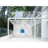
| DESIGN NAME: KennaXu Gallery PRIMARY FUNCTION: Showroom INSPIRATION: The space is dominated by white hue, which produces a modern, simplistic spatial tone as well as an inclusive backdrop that reveals the authenticity of things. It can fully display the color, composition, aesthetics and thinking of exhibited paintings. The design incorporates a sense of "emptiness" UNIQUE PROPERTIES / PROJECT DESCRIPTION: The design team reflected on the relationship between gallery and art space, and discovered more possibilities of the gallery as a public space. Located in an old residential community, the site blends a strong living atmosphere with beautiful natural landscape, making it possible to integrating art aesthetics and learning into daily life. OPERATION / FLOW / INTERACTION: The unique windows shake off traditional designs, and act as openings for conveying messages. Meanwhile, those structures bring in the daily chatter of residents, sounds of footsteps and birdsong from outdoor groves, which become background music for the art space. The gallery seems to grow here and closely integrates with the old community. PROJECT DURATION AND LOCATION: The project started in November, 2018 and finished in September, 2019 in the Intersection of Yitian Road and Fuqiang Road, Futian District, Shenzhen, China. FITS BEST INTO CATEGORY: Interior Space and Exhibition Design |
PRODUCTION / REALIZATION TECHNOLOGY: Latex paint, membrane, wooden flooring, ultra-clear glass, white tile, white stainless steel SPECIFICATIONS / TECHNICAL PROPERTIES: The project is 223 square meters in all. TAGS: Art gallery, Shenzhen, public space, color, freedom, openness, multi-sensory experiences RESEARCH ABSTRACT: The building, constructed in the 1990s within an old community, is the place where the gallery owner Kenna Xu spent his childhood. It carries his deep affection for Shenzhen, and also breeds his dream of establishing a contemporary art gallery that finds a foothold in the local area and pursues global visibility. CHALLENGE: There were also some unfavorable conditions as converting the former residence into an art space. The original space consisted of two floors, which were narrow and dim. The first floor had a low ceiling, looking like a storeroom, while the second floor featured an old-styled, disordered and fragmented spatial pattern. The overall space looked so different from an art space. ADDED DATE: 2021-02-26 03:30:12 TEAM MEMBERS (4) : Design Firm: DA INTEGRATING LIMITED, Chief Designer: Chinman Ngai, Cooperators: Artist Yang Shu and Cooperators: Ma Shuqing IMAGE CREDITS: Photo by: Kevin, Benmo Studio |
||||
| Visit the following page to learn more: http://www.daintegrating.com | |||||
| AWARD DETAILS | |
 |
Kennaxu Gallery Showroom by Da Integrating Limited is Winner in Interior Space and Exhibition Design Category, 2020 - 2021.· Read the interview with designer Da Integrating Limited for design KennaXu Gallery here.· Press Members: Login or Register to request an exclusive interview with Da Integrating Limited. · Click here to register inorder to view the profile and other works by Da Integrating Limited. |
| SOCIAL |
| + Add to Likes / Favorites | Send to My Email | Comment | Testimonials | View Press-Release | Press Kit |
Did you like Da Integrating Limited's Interior Design?
You will most likely enjoy other award winning interior design as well.
Click here to view more Award Winning Interior Design.


