Ballantines 17 Gift Packaging by Li-Shang Printing Co., Ltd |
Home > Winners > #120433 |
 |
|
||||
| DESIGN DETAILS | |||||
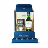
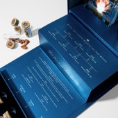
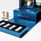
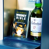
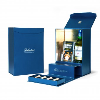
| DESIGN NAME: Ballantines 17 PRIMARY FUNCTION: Gift Packaging INSPIRATION: Ballantine’s 17 Year Old blended whisky has been named 2020 Scotch Blend of the Year in Jim Murray’s Whisky Bible. This limited edition packaging celebrates the famous whisky for its 7th win of the same title. The idea that Bible signifies the most important print, we use this as our core concept. Combined with Ballantine's signature blue color, we designed a conceptual space that translates a gilded magnificent altar into an elevated stage for the liquor bottle and the Whisky Bible. UNIQUE PROPERTIES / PROJECT DESCRIPTION: As users unfold and interact with the packaging, the visuals, the smells and then the tastes create a sensuous experience to emphasize the value of the whisky. OPERATION / FLOW / INTERACTION: When users open the plain blue box the bible will emerge on the golden stage, placed right next to the prestige Scotch Blend whisky. As a pathway leading up to the stage, the gold prints record the past seven awarded years. Cork bottled samples of the spices and flavors are presented at the front of the box cover to provide users a more dynamic experience for the sense of smell right before their first sip of the whisky. PROJECT DURATION AND LOCATION: The project started in Taiwan in June 2020 and completed in Taiwan in August 2020. FITS BEST INTO CATEGORY: Packaging Design |
PRODUCTION / REALIZATION TECHNOLOGY: Rigid box with UV Offset printing on silver foil paper, gold and blue spot color with embossing technique on logos. The highlight of the packaging is the conveyor belt mechanism that is installed under the box which allows the bible stand to rise up as users lay down the box cover. SPECIFICATIONS / TECHNICAL PROPERTIES: Width (250 mm) x depth (155 mm) x height (370 mm), Bottle capacity 700ml TAGS: whisky, packaging, liquor packaging, creative packaging RESEARCH ABSTRACT: With Bible as our inspiration, we wanted to portray a sacred moment with the honorable mentioned whisky, as if it is presented at the end of a holy altar. The key is to convey the concept of time and create interactions with the senses through special structural mechanism and thoughtful placement of objects. We had planned to design the flow of the interaction as this: First, users witness the rising bible. Then they proceed to read the honorable past of the whisky. Finally, they take in the aromas of the spices at the front before they enjoy the whisky. The whole experience is presented in the sequence of visual, smell then taste. CHALLENGE: The moment from unfolding the packaging to drinking the liquor, we carefully design how the users would interact with the components and how the experience of colors, movements, smells and tastes will present the value of the brand to its full potential. ADDED DATE: 2021-02-25 10:21:27 TEAM MEMBERS (3) : Design director: Sheng-Hsun Hong, Graphic designer: Chih-Chen Huang and Packaging structural designer: Li-Fan Liu IMAGE CREDITS: Image #1: Photographer Yi-Han Pan, 2021. Image #2: Photographer Yi-Han Pan, 2021. Image #3: Photographer Yi-Han Pan, 2021. Image #4: Photographer Yi-Han Pan, 2021. Video: Editor Yi-Han Pan, 2021. |
||||
| Visit the following page to learn more: http://lsprint.com.tw/ | |||||
| AWARD DETAILS | |
 |
Ballantines 17 Gift Packaging by Li-shang Printing Co., Ltd is Winner in Packaging Design Category, 2020 - 2021.· Press Members: Login or Register to request an exclusive interview with Li-Shang Printing Co., Ltd. · Click here to register inorder to view the profile and other works by Li-Shang Printing Co., Ltd. |
| SOCIAL |
| + Add to Likes / Favorites | Send to My Email | Comment | Testimonials | View Press-Release | Press Kit |

