Radailiai Visual Identity by Stand Up Team |
Home > Winners > #120415 |
 |
|
||||
| DESIGN DETAILS | |||||
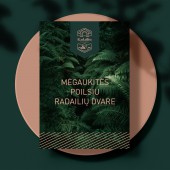
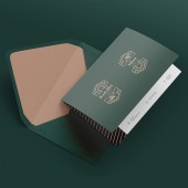
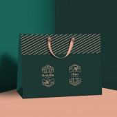
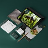
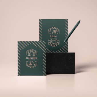
| DESIGN NAME: Radailiai PRIMARY FUNCTION: Visual Identity INSPIRATION: A logo that conveys two different messages. Combine these two, from the very first sight totally different spheres & create one visual identity, one harmonious brand image. The style of Dino Park remains a bit more playful, and that of Radailiai Manor is solid, but with stylized details, it matches the first. The combination of dark green and rose gold gives Raidailiai manor solidity. UNIQUE PROPERTIES / PROJECT DESCRIPTION: The upper part of the Radailiai manor logo depicts a stylized fragment of an arch (manor symbol), a pattern of diagonal lines, and a motif of water waves (SPA, water, tranquillity). The lower part of the logo depicts an analogous water motif and a stylized dinosaur. Changing the text part of the logo and rotating the hexagon icon 180 ° results in the Dino Park logo with a dinosaur at the top and an inverted house at the bottom! OPERATION / FLOW / INTERACTION: The logo was simplified, and supported by a simple, and clear visual identity. PROJECT DURATION AND LOCATION: The project started in December 2019 in Klaipeda and finished in May 2020. FITS BEST INTO CATEGORY: Graphics, Illustration and Visual Communication Design |
PRODUCTION / REALIZATION TECHNOLOGY: Palette of deep green and rose gold looks solid for manor image, but is easily transformed to the greens of Dino park jungle! SPECIFICATIONS / TECHNICAL PROPERTIES: We created the design for business cards, posters, envelopes, and gift bags. TAGS: Visual identity, Restaurant, Logo, Graphic Design, Lithuania RESEARCH ABSTRACT: With the elegant and unique color combination, the new visual identity brings out a modern and fresh look. CHALLENGE: The creative challenge was to bring together two different worlds so you can clearly see their unique identity. ADDED DATE: 2021-02-25 09:48:32 TEAM MEMBERS (2) : Designer: Grete Milkinte and Creative Director: Inesa Budgine IMAGE CREDITS: Stand Up Team, 2020. |
||||
| Visit the following page to learn more: https://thestandup.lt/en/radailiai-manor |
|||||
| AWARD DETAILS | |
 |
Radailiai Visual Identity by Stand Up Team is Winner in Graphics, Illustration and Visual Communication Design Category, 2020 - 2021.· Read the interview with designer Stand Up Team for design Radailiai here.· Press Members: Login or Register to request an exclusive interview with Stand Up Team. · Click here to register inorder to view the profile and other works by Stand Up Team. |
| SOCIAL |
| + Add to Likes / Favorites | Send to My Email | Comment | Testimonials | View Press-Release | Press Kit |
Did you like Stand Up Team's Graphic Design?
You will most likely enjoy other award winning graphic design as well.
Click here to view more Award Winning Graphic Design.


