Quix Branding by Anja Zambelli Colak |
Home > Winners > #120357 |
 |
|
||||
| DESIGN DETAILS | |||||
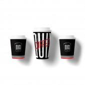
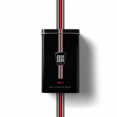
| DESIGN NAME: Quix PRIMARY FUNCTION: Branding INSPIRATION: Italians are unparalleled at coffee drinking and nurturing coffee culture. Quix was inspired by the juxtaposition of this languid Italian coffee culture and grabbing a quick cup of coffee. The design weaves Italian values into its visual identity with colors and textures that pay homage to the golden age of Italian design. Its vintage appeal evokes Italian charm with the aroma of premium coffee - because despite the fast pace, find time to take a break and enjoy life. Dolce vita. UNIQUE PROPERTIES / PROJECT DESCRIPTION: Quix’s design was created by choosing colors, textures, and forms from Italian culture that pay homage to the golden age of Italian design and the giants that defined it. The design nods to the Dolce Vita years with a slightly vintage appeal that transports the consumer to a more relaxed space. This design is unique because it was able to capture the essence of Italian aesthetics and implement them on a smaller scale - vending machines. OPERATION / FLOW / INTERACTION: Quix are quality self-service vending machines that provide hot and cold drinks and snack meals, with guaranteed product quality, in an attractive form. As the consumer approaches to purchase a cup of coffee, Quix immediately creates a unique visual experience in the space where the vending machine is installed. Unlike typical vending machines, the design is an integral part of the experience and immediately transports the consumer to a different time and place evoking Italian coffee culture. PROJECT DURATION AND LOCATION: The project started in January 2020 and finished in August 2020 in Rijeka, Croatia. FITS BEST INTO CATEGORY: Graphics, Illustration and Visual Communication Design |
PRODUCTION / REALIZATION TECHNOLOGY: Coffee cups and posters were printed using CMYK colour and offset technology. Vending machines are branded using printed foils. SPECIFICATIONS / TECHNICAL PROPERTIES: To go coffee cup small: 46x60 mm To go coffee cup big: 59x110 mm Metal coffee box: 12x18 cm TAGS: Branding, Coffee, vending machine, QSR, quick service, Italian, Italian design, Italian aesthetics RESEARCH ABSTRACT: Workshops were conducted to set up a brand strategy. The objective was to define brand essence and philosophy, expected brand experience, brand personality and character definition, brand target groups, and market positioning. The personality defined – Quix is an elegant, clever friend and assistant inspired by Italian aesthetics. Thorough research of the history of Italian graphic design was conducted before concept development. Design prototyping tested the identity at every brand touchpoint. CHALLENGE: Challenges faced included a market oversaturated with coffee products, quality not being a competitive advantage in vending machine products, limited physical thus limited space to communicate brand experience. Due to the low price point, brand packaging and collaterals needed to be designed keeping in mind a low budget and the design needed to appeal to a wide range of consumers – from university students (Gen Z) to blue-collar workers (Boomer) and office staff (Millennials). ADDED DATE: 2021-02-25 08:05:09 TEAM MEMBERS (1) : IMAGE CREDITS: Anja Zambelli Colak, 2020. |
||||
| Visit the following page to learn more: https://zambellidesign.com/quix_en/ | |||||
| AWARD DETAILS | |
 |
Quix Branding by Anja Zambelli Colak is Winner in Graphics, Illustration and Visual Communication Design Category, 2020 - 2021.· Press Members: Login or Register to request an exclusive interview with Anja Zambelli Colak. · Click here to register inorder to view the profile and other works by Anja Zambelli Colak. |
| SOCIAL |
| + Add to Likes / Favorites | Send to My Email | Comment | Testimonials | View Press-Release | Press Kit |


