Miltos Botchan Ressha Packaging by Yuta Takahashi |
Home > Winners > #120283 |
 |
|
||||
| DESIGN DETAILS | |||||
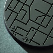
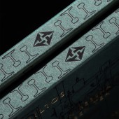
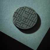
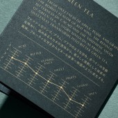
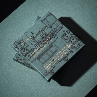
| DESIGN NAME: Miltos Botchan Ressha PRIMARY FUNCTION: Packaging INSPIRATION: The creator was inspired by two people who produce things without compromise. The original appearance of the train is accurately reproduced in the package. Through the elements of design that capture the locomotive's steampunk feel in a good way, one can enjoy its original charm. The chocolate has a playful design to it that expresses the route on which the train runs as a maze. The contrast and fusion of two different designs is related to their collaboration. UNIQUE PROPERTIES / PROJECT DESCRIPTION: A collaborative product and package between a locomotive with more than 130 years of history and an up-and-coming, well acclaimed chocolatier. The package's form has a sense of luxury reminiscent of perfume, with precise train drawings that would make fans groan reproduced with foil stamping. The deep green of the package symbolizes the trade color of the train and the color of matcha chocolate. The chocolates are decorated with the motif of an actual route map, adding a touch of playfulness. OPERATION / FLOW / INTERACTION: It was designed to give the consumer a cultural experience that will improve their life by eating this chocolate. The perfume-inspired packaging takes them to a new frontier, to enjoy the mellow aroma of chocolate made from real cocoa. By consuming it while enjoying the maze, they can visit the route and background of the areas and cultures where the train runs. In addition, each stop and route map is explained on the attached card. Eating enhances creativity, leading to a time of refinement. PROJECT DURATION AND LOCATION: The project started in Japan in July 2019 and ended in February 2020. It was announced in September 2020. FITS BEST INTO CATEGORY: Packaging Design |
PRODUCTION / REALIZATION TECHNOLOGY: It has been manufactured with accuracy, artistry and entertainment. The trains are drawn with respect for railroad fans and its history, based on photographs of the actual trains taken by the designers themselves. The printing uses matte black foil stamping to express the train's calm texture. The line width seeks maximum tenuity through repeated trial production. The lines and logos engraved on the chocolate are designed to have a depth measurable in microns, so that beautiful shadows appear. SPECIFICATIONS / TECHNICAL PROPERTIES: Box: 101.6mm x 101.6mm x 12.7mm (Uses deep green fine paper. The locomotive is matte black foil stamped. The logo and product name are stamped with matt gold foil.) Card: 250mm x 83mm Chocolate: 76.5mm x 76.5mm x 5.5mm TAGS: Branding, Packaging, Chocolate, Foil stamping, Maze, Food, Art deco, Japan RESEARCH ABSTRACT: The elements necessary to raise chocolate to gourmet status without compromising essence are being researched. A conclusion was reached about how fragrance is an important component, and a package produced that creates an impression of perfume. This locomotive, rugged but with a petite and cute side, is expressed through drawings and a maze of maps. The mechanical and cultural features have been extracted to create something to be enjoyed by children and adults alike. CHALLENGE: The most difficult task is to accurately reproduce the design applied to chocolate. Many trials were made to engrave an accurate pattern on the chocolate, which crumbles easily, giving it an artistic finish. Keeping in mind that the role and beautiful form of the train exist when it's running, the drawing of the train is arranged so as to surround the package, and the static package expresses the dynamic role of a train that has been running for many years. ADDED DATE: 2021-02-25 04:13:06 TEAM MEMBERS (3) : Art Director: Yuta Takahashi, Designer: Yuta Takahashi and Photographer: Yuta Takahashi IMAGE CREDITS: Image 1: Photographer Yuta Takahashi, 2020 Optional Image 1: Photographer Yuta Takahashi, 2020 Optional Image 2: Photographer Yuta Takahashi, 2020 Optional Image 3: Photographer Yuta Takahashi, 2020 Optional Image 4: Photographer Yuta Takahashi, 2020 |
||||
| Visit the following page to learn more: http://yutatakahashi.jp | |||||
| AWARD DETAILS | |
 |
Miltos Botchan Ressha Packaging by Yuta Takahashi is Winner in Packaging Design Category, 2020 - 2021.· Press Members: Login or Register to request an exclusive interview with Yuta Takahashi. · Click here to register inorder to view the profile and other works by Yuta Takahashi. |
| SOCIAL |
| + Add to Likes / Favorites | Send to My Email | Comment | Testimonials | View Press-Release | Press Kit |

