DESIGN NAME:
City Corner
PRIMARY FUNCTION:
Residence
INSPIRATION:
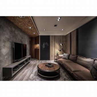
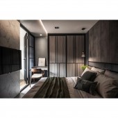
Inspired by the Vintage Industrial Style, the space adopts rustic material elements while controlling the lighting of the long and narrow space in order to maximize the natural light into the space. The design team implemented a smooth and coherent design approach, such as turning the space direction, enlarging the window openings, setting up hollow cabinets as storage space, and appropriately separates each area according to its function. The design also focuses on color matching combinations, so that a quiet and leisurely tone of the space is reflected in the calm and simple color palette.
UNIQUE PROPERTIES / PROJECT DESCRIPTION:
The design team then chose the Vintage Industrial Style as the design direction, in which, walls of the public area are plastered with gray paint to retain the rustic and old texture of the original space. The design team uses natural color light, transparent materials, rotate the direction of the kitchen and enlarging the window openings to improve the lighting of the original long and narrow space. By adopting Morandi tones, solid wood tone, gray materials, ironwork, and other materials, the space reveals a harmonious feeling of rustic nature.
OPERATION / FLOW / INTERACTION:
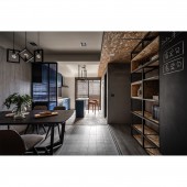
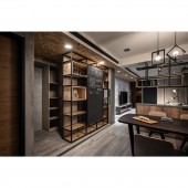
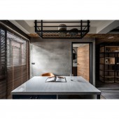
The design team has adjusted the space layout and natural light to not only solve and eliminate the limitation of the existing narrow space, but also bring in the natural light to make the space well ventilated and comfortable. Inasmuch how to provide the client with enough storage space without giving too much abruptness to the space, was the top consideration of the design team since the beginning of the design process. In the space, hidden doors, hollow cabinets, movable cabinets, and hanging iron shelves are used to bring more convenience and flexibility to the space.
PROJECT DURATION AND LOCATION:
The project was completed in July 2020 in New Taipei City, Taiwan.
FITS BEST INTO CATEGORY:
Interior Space and Exhibition Design
|
PRODUCTION / REALIZATION TECHNOLOGY:
Woodgrain tiles, Tiles, Composite super wear-resistant floor, Concrete, OSB solid wood fiberboard, Black matte roasted iron, Blackboard paint, Gray glass, Grey Mirror, E1 board, Customized Changhong Glass, Solid wood carved door, Teakwood, Gray ceramic glass, Solid wood fiberboard. Taking the Vintage Industrial Style as the main direction of this project and defining a unique spatial perception in a long and narrow space. The design team particularly selected natural materials with the wood tone, and through the characteristics of each material bring more functionality to the space.
SPECIFICATIONS / TECHNICAL PROPERTIES:
The designed area of the project is about 100 square meters, and the space has a long and narrow characteristic. Hence, the design team has arranged the functional zonings in a way that best suits the user's circulation and needs. Furthermore, creatively implemented the no wall idea to create a more complete and spacious living space compared to the original layout. The design team chose the Vintage Industrial Style as the design direction and adopts many rustic materials to show the richness of the layers under the same tone and different material combinations.
TAGS:
Vintage Retro Style, Industrial style, Turning design, Morandi color, OSB solid wood fiberboard.
RESEARCH ABSTRACT:
The design team took the original condition of the original site as a major consideration and established a smooth layout and circulation planning of each area in the long and narrow space, introduced the daylight and bringing out a warm feeling as the light penetrates into the space by the use of hollow cabinets and enlarged window openings. Used OSB solid wood fiberboard, wood grain tiles, gray-colored glass, grey mirror, and iron components to create a rustic look of the Vintage Industrial style design.
CHALLENGE:
By thoroughly considering the people's movement circulation and the natural light source, the direction of the kitchen and master bedroom were reoriented, enlarging the size of the window size, and using hollow storage cabinets as space partition, which not only allowed the natural light to penetrate and continue into the room but as a result, also provided more seamless and unobstructed storage space, eliminating the inconvenience caused by the narrow and long original space.
ADDED DATE:
2021-02-24 03:58:32
TEAM MEMBERS (1) :
Chen-Yu Chiu
IMAGE CREDITS:
Chuang Photo Studio
|
