Diablo Black Wine Packaging by Ximena Ureta |
Home > Winners > #119906 |
 |
|
||||
| DESIGN DETAILS | |||||
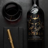
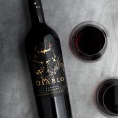
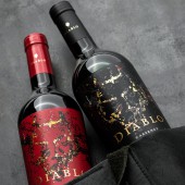
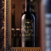
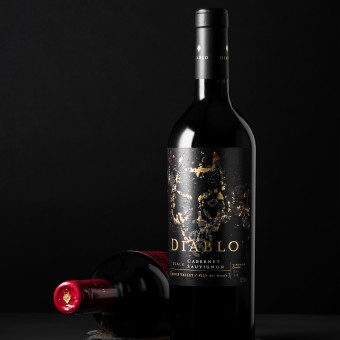
| DESIGN NAME: Diablo Black PRIMARY FUNCTION: Wine Packaging INSPIRATION: Diablo Black is a pact with the extraordinary, where the serious and traditional give way to the sophisticated and disruptive. It is an intriguing and attractive brand, in which the Devil is the protagonist who seeks out those who want to be tempted by a wine that reflects his dark and mysterious style. 6 months that make the difference, 6 weeks that define a style, 6 days that are the precise time for perfection. The winemaking process follows Diablo's characteristic style. UNIQUE PROPERTIES / PROJECT DESCRIPTION: Diablo Black is a wine that combines the tradition of the acclaimed terroir of Maule, southern Chile, with superior winemaking know-how. With grapes that have ripened to perfection, it has delicious notes of black fruits, and is generous, flavorful, dark and mysterious. Diablo is enriched by the earth and energized by its molten core. OPERATION / FLOW / INTERACTION: The brand focuses on the most daring and demanding consumers, who value brands that set them apart as unique individuals. They select wines based not only on their quality or winemaking characteristics, but also on the values that the brand stands for. They care about their image and seek out brands that can contribute something to their personal style, with value proposals that go beyond the product itself, expanding to include a broader experience. PROJECT DURATION AND LOCATION: The project started in March 2019 in Santiago, Chile. It was launched in March 2020. FITS BEST INTO CATEGORY: Packaging Design |
PRODUCTION / REALIZATION TECHNOLOGY: Label: Offset printed in 7 special colors on Estate #8 - Self-adhesive, pantone Black, pantone 438U, pantone 1935U, pantone 877U, pantone 109U, pantone 433U, matt gold foil, stamp and UV Satin varnish. SPECIFICATIONS / TECHNICAL PROPERTIES: Conical label. Upper width: 10.60 mm. Lower width: 10 mm. Height: 12.20 mm TAGS: Diablo Black, Diablo Red, Concha y Toro, Ximena Ureta, wine packaging, label design,Chilean wine, packaging. RESEARCH ABSTRACT: The difficulties in the technical delivery for this project were very demanding. Several tests were made to achieve, among many things, the printing of the colors on shiny gold foil, so that the Devil's face could be seen between blacks, reds and gold foil with a burnt appearance. CHALLENGE: The creative challenge for Diablo Black was to visually represent the Devil’s mysterious, intriguing, sophisticated, irreverent, dark and elegant personality: a personality that would produce a strong attraction to the extraordinary. To combine the tradition of the wine industry and the modernity of the brand's spirit. The challenge for a label like this is to design a packaging that could appeal several markets in the world. ADDED DATE: 2021-02-23 22:14:35 TEAM MEMBERS (1) : Art direction and design: Ximena Ureta, Production: Juan Rojas, Printing: Acrus CCL Chile. IMAGE CREDITS: Image #1: Macarena Álvarez, Image #2: Macarena Álvarez, Image #3: Macarena Álvarez, Image #4: Macarena Álvarez, Image #5: Macarena Álvarez |
||||
| Visit the following page to learn more: http://www.ximenaureta.cl | |||||
| AWARD DETAILS | |
 |
Diablo Black Wine Packaging by Ximena Ureta is Winner in Packaging Design Category, 2020 - 2021.· Press Members: Login or Register to request an exclusive interview with Ximena Ureta. · Click here to register inorder to view the profile and other works by Ximena Ureta. |
| SOCIAL |
| + Add to Likes / Favorites | Send to My Email | Comment | Testimonials | View Press-Release | Press Kit |

