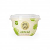
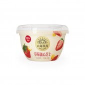
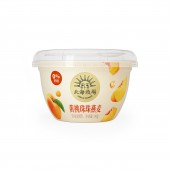
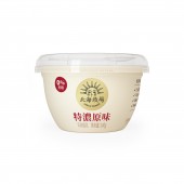
Hokkai Pastures Gem Cup Flavored Yogurt by Genki Forest |
Home > |
 |
|
||||
| DESIGN DETAILS | |||||
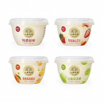
| DESIGN NAME: Hokkai Pastures Gem Cup PRIMARY FUNCTION: Flavored Yogurt INSPIRATION: The brand logo is inspired by the ancient mythological sun god, and the cup body design uses the form of artistic illustrations. Designer waves a natural magic wand with different illustration elements. The sun rises and everything recovers, representing different flavors of flexible elements jumping into a warm background. The power of food extends from this to every consumer's heart. UNIQUE PROPERTIES / PROJECT DESCRIPTION: Gem Cup is a fresh yogurt of Hokkai Pastures. Hokkai Pastures uses natural high-quality ingredients and ingenious craftsmanship to create dairy products that can bring warmth and power to people. The product design of the Gem Cup series also adheres to the brand core of nature, warmth and power source. OPERATION / FLOW / INTERACTION: The cup cover and cup body of the product use many round horn elements, creating a soft feeling as a whole. Bring consumers a friendly and soft visual feeling. The pale yellow background of the cup body echos the overall body design and brand tonality, bringing warm visual feelings to consumers through soft warm tones. When consumers need a richer taste, the 95mm large caliber design of this product is more convenient for consumers to add nuts, fruits and other elements to yogurt to enjoy. PROJECT DURATION AND LOCATION: The design drawing was confirmed on July 21, 2020, and the Solid Forging Die was completed in October 2020, and it was launched in January 2021. FITS BEST INTO CATEGORY: Packaging Design |
PRODUCTION / REALIZATION TECHNOLOGY: Cup body:PP material plastic cup Product label:Shrinkwrap We used PP material plastic cup, in addition to considering strength, transparency, barrier function and ultraviolet resistance, the most important thing is that it is also 100% recoverable.It can not only reprocess waste into treasure, but also reduce environmental pollution and waste of resources. SPECIFICATIONS / TECHNICAL PROPERTIES: Dimensions: Width 96mm x Height 63mm TAGS: Branding, Packaging, 3D, dairy RESEARCH ABSTRACT: We conducted surveys both online and offline for the preference and popularity of aesthetics in designs after the preliminary stage. Each question were designed to test out our design or unique product features against real competitors in the market side by side, thus be more grounded in our analysis and results. We have more confidence to have science back up our product and packaging design. CHALLENGE: In order to better transmit brand information, LOGO occupies a larger proportion of the cup body. The shape of the cup body is not a regular cylindrical shape, so logo will deform during the lamination process. We made dozens of adjustments to ensure that after lamination, the logo can present a perfect circle on the cup. ADDED DATE: 2021-02-23 10:46:42 TEAM MEMBERS (7) : Brand Worldview:Dan Dong, Yijing Zhou, Product Manager:Gerile Qingyin, Copywriter:Xi Sun, Package Design:Chao Wang , You Li and Illustration Design:You Li IMAGE CREDITS: Xi Sun |
||||
| Visit the following page to learn more: http://www.yuanqisenlin.com/ | |||||
| AWARD DETAILS | |
 |
Hokkai Pastures Gem Cup Flavored Yogurt by Genki Forest is Runner-up for A' Design Award in Packaging Design Category, 2020 - 2021.· Press Members: Login or Register to request an exclusive interview with Genki Forest. · Click here to register inorder to view the profile and other works by Genki Forest. |
| SOCIAL |
| + Add to Likes / Favorites | Send to My Email | Comment | Testimonials |

