La Place by Centred Exhibition Cafe and Office Space by Zhen-xi Pang |
Home > Winners > #119700 |
 |
|
||||
| DESIGN DETAILS | |||||
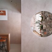
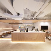
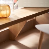
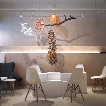
| DESIGN NAME: La Place by Centred PRIMARY FUNCTION: Exhibition Cafe and Office Space INSPIRATION: The office space "La Place by Centred", a new type of multifunctional exhibition cafe, which located in the Mingsheng community. Project owner is an entrepreneur who has lived abroad for a long time. After he has experienced many coffee shops around the world, he expected the coffee shop to be an avant-garde one with minimalist style must and must have a pure image of Japanese. The original shape of the space is a narrow and long one, people can see through it with no difficulty, also have many messy pipelines hanging on both wall and ceiling. Therefore, we must use some space to make a separation to highlight the front, middle and back spaces, also a vertical movement line is drawn to extend to the rear. The ceiling is horizontal. The wood grain axis runs through the whole space. UNIQUE PROPERTIES / PROJECT DESCRIPTION: Work times Chill is like Cafe times milk. Looking at the whole shop, the most prominent feature is the gradient latte color with a strong sense of hand brush on the wall. This beautiful gradient color is especially created for the on-site lighting and veneer color. Most importantly, the special gradation paint make this space with its own character. In order to give the space an art gallery-like experience, and considering about match the frequently-entered commercial space at the same time, we used white diamond coating on the floor of coffee area. As the background of the performance, the floor is as simple and as clean as possible, and to meet the needs of frequent use. This paint can provide waterproof, anti-slip and anti-cracking effect. OPERATION / FLOW / INTERACTION: In order to give the space an art gallery-like experience, and considering about match the frequently-entered commercial space at the same time, we used white diamond coating on the floor of coffee area. As the background of the performance, the floor is as simple and as clean as possible, and to meet the needs of frequent use. This paint can provide waterproof, anti-slip and anti-cracking effect. PROJECT DURATION AND LOCATION: The project started in July 2020 in Taipei and finished in September 2020 in Taipei. FITS BEST INTO CATEGORY: Interior Space and Exhibition Design |
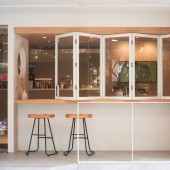
PRODUCTION / REALIZATION TECHNOLOGY: In order to give the space an art gallery-like experience, and considering about match the frequently-entered commercial space at the same time, They used white diamond coating on the floor of coffee area. As the background of the performance, the floor is as simple and as clean as possible, and to meet the needs of frequent use. This paint can provide waterproof, anti-slip and anti-cracking effect. Among them, the dining bar is the sprite to this coffee shop. Not only should it be beautiful, but the cash register area, the hand-brewing area, and the light meal production area are all planning points. Not only a sense of beauty, a smooth preparing traffic of this bar is crucial. Staff need to finish all meal preparation in a rapid but smooth condition, and can respond to consumer crowds at any time. SPECIFICATIONS / TECHNICAL PROPERTIES: The total space is 132 square meters TAGS: Cafe, Exhibition space, Office speace,influencer coffee shop, Coworking space, La Place by Centred RESEARCH ABSTRACT: "LA PLACE by centred" outlines the beauty of space with various corner and window views, shaping modern life with check-in spots, and immersing people in this ceremony of a cup of coffee. And we look forward to develop a new type of shared space in the community, so that people can enjoy an independent office space; within a multi-function field, to extent art and cultural life. At the same time, through this coffee shop, LA PLACE becomes where community residents to stop and enlarge life circle, ideas and friendships. CHALLENGE: The original shape of the space is a narrow and long one, people can see through it with no difficulty, also have many messy pipelines hanging on both wall and ceiling. Therefore, we must use some space to make a separation to highlight the front, middle and back spaces, also a vertical movement line is drawn to extend to the rear. The ceiling is horizontal. The wood grain axis runs through the whole space. ADDED DATE: 2021-02-23 03:52:33 TEAM MEMBERS (2) : ZHEN-XI,PANG - China University of Technology and HUI-WEN,HSIAO IMAGE CREDITS: Image #1 : Photographer Laplace by Centred Image #2 : Photographer Laplace by Centred Image #3 : Photographer 隨寓工作室 Image #4 : Photographer 隨寓工作室 Image #5 : Photographer 隨寓工作室 PATENTS/COPYRIGHTS: IP:JCPC DESIGN |
||||
| Visit the following page to learn more: https://www.jcpcdesign.com/Projects/Deta |
|||||
| CLIENT/STUDIO/BRAND DETAILS | |
 |
NAME: JCPC DESIGN PROFILE: Interior design requires careful cultivation and time to ferment silently; Creating a happy smile for every space user is our greatest achievement. |
| AWARD DETAILS | |
 |
La Place by Centred Exhibition Cafe and Office Space by Zhen-Xi Pang is Winner in Interior Space and Exhibition Design Category, 2020 - 2021.· Read the interview with designer Zhen-xi Pang for design La Place by Centred here.· Press Members: Login or Register to request an exclusive interview with Zhen-xi Pang. · Click here to register inorder to view the profile and other works by Zhen-xi Pang. |
| SOCIAL |
| + Add to Likes / Favorites | Send to My Email | Comment | Testimonials | View Press-Release | Press Kit |
Did you like Zhen-Xi Pang's Interior Design?
You will most likely enjoy other award winning interior design as well.
Click here to view more Award Winning Interior Design.


