Holistic Healing Retail Pharmacy by Chaos Design Studio |
Home > Winners > #119695 |
 |
|
||||
| DESIGN DETAILS | |||||
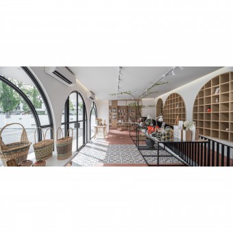
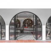
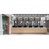
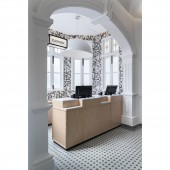
| DESIGN NAME: Holistic Healing PRIMARY FUNCTION: Retail Pharmacy INSPIRATION: Nestled in the heritage zone, the design retains the elements of the existing building to provide a heritage touch to the pharmacy. The reuse of existing three arches of the building to create more openings demonstrates permeability by showing the interrelationship between retail spaces. The structural elements, furniture and finishing were designed with playful and light forms, materials and colour to create a cheerful ambience, aiming to get away from rigid traditional pharmacy design. UNIQUE PROPERTIES / PROJECT DESCRIPTION: The traditional pharmacies are often depicted to have a rigid environment. The interior of pharmacies is commonly designed to be cold and bright, resulting in consumers spending a short amount of time visiting for the health products and medications. Wellings aims for a different approach which allows consumers to enjoy their time visiting. By adding leisure and cheerful ambience to the space, it motivates consumers to be more inclined to taking care of their physical and mental health. OPERATION / FLOW / INTERACTION: The layout is designed to show interrelationship between the five functions located on ground floor; retail for lifestyle, body care, rehabilitation, healthcare and consultation. Artisanal products and bookstore are categorised as lifestyle. Over-the-counter retail for body and healthcare are adjacent to the consultation area. With the rehabilitative care retail located at the rear, a ramp is designed for the disabled to access. A multipurpose hall above is designated for meetings and seminars. PROJECT DURATION AND LOCATION: The project commenced in May 2019 and was completed in February 2020. Located at 294, Macalister Road, 10400 George Town, Penang Malaysia. FITS BEST INTO CATEGORY: Interior Space and Exhibition Design |
PRODUCTION / REALIZATION TECHNOLOGY: The concepts and designs are developed with the considerations of criteria listed by the client, such as the mood, the purpose and the location. The planning begins with a mood board proposal derived from the collected information. Once the concept has been decided, a site analysis is conducted before commencing. The team then begins their idea development through layout drafting to determine the flow of the interior and moving on to the 3D schematic designs once the layout is finalized. SPECIFICATIONS / TECHNICAL PROPERTIES: Formerly a residential building, the total built up area of the existing building is 3400 sqft. The ground floor of building consists of an entrance foyer, living room, dining area, kitchen, bathroom, some bedrooms with a small maid room at the rear. Going up the spiral staircase to the first floor was a large room connected to three balconies and a bathroom. An emergency exit located beside the bathroom leads to an emergency staircase. TAGS: Healthcare, Pharmacy, Heritage, Retail, Lifestyle, Skincare, Arts, Body Care RESEARCH ABSTRACT: Designing for a retail pharmacy requires not only the client requirements but also research on the flow of the pharmacy. The layout is determined by the space allocation and sizes for each of the functions, along with the hierarchy of the spaces. As a pharmaceutical retail with rehabilitative care equipment, considerations for the disabled are also inputted into the design such as by adding ramps or providing ample space for equipment demonstrations. CHALLENGE: With the heritage building conservation requirements in consideration, it is a challenge to devise a suitable design concept. The original character and building profile are to be retained. The internal alterations, rear and side extensions were allowed for adaptive reuse of the building that would enhance the quality of the existing building. The architectural elements are to be consistent along with the material usage as they have to be in a similar profile, design, colour and texture. ADDED DATE: 2021-02-23 03:14:50 TEAM MEMBERS (3) : Charles Khor, Serena Foo and Ng Ke Quan IMAGE CREDITS: All images: TWJPTO |
||||
| Visit the following page to learn more: http://cutt.ly/XlbWxPQ | |||||
| AWARD DETAILS | |
 |
Holistic Healing Retail Pharmacy by Chaos Design Studio is Winner in Interior Space and Exhibition Design Category, 2020 - 2021.· Read the interview with designer Chaos Design Studio for design Holistic Healing here.· Press Members: Login or Register to request an exclusive interview with Chaos Design Studio. · Click here to register inorder to view the profile and other works by Chaos Design Studio. |
| SOCIAL |
| + Add to Likes / Favorites | Send to My Email | Comment | Testimonials | View Press-Release | Press Kit |
Did you like Chaos Design Studio's Interior Design?
You will most likely enjoy other award winning interior design as well.
Click here to view more Award Winning Interior Design.


