LendMe Brand Identity by Ruis Vargas |
Home > Winners > #119666 |
 |
|
||||
| DESIGN DETAILS | |||||
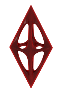
| DESIGN NAME: LendMe PRIMARY FUNCTION: Brand Identity INSPIRATION: The aesthetics of LendMe seeks to create a graphic environment structured and sustained by itself and solid. Thus, the use of colours sought to establish a complementary palette, in which purple is the basis, trust, and orange and blue are the colours of the relationship, effusive and intense. Just as the logo has a binary structure, representing relations antagonistic essence, the use of colours allows working with duality, from the welcoming and intense to the sober and balanced. UNIQUE PROPERTIES / PROJECT DESCRIPTION: To operate in the home equity market, a group of investors sought to build a brand that would convey the concept of help and solidarity, in a balanced financial relationship with its client. From this premise, the LendMe brand was built: the logo structure has an iconographic representation that refers to binary codes balanced between each other, suggesting both a mathematical concept and the relationship between LendMe and his client, where lending is a two-way street. OPERATION / FLOW / INTERACTION: The need to transitioning between as distant audiences as consumers and companies was the premise of the brand. Therefore, the language project should anticipate the flotation on the daily approach of the communication of the LendMe brand. The result was the establishment of the usage of the brand colours in an elementary didactic, fitting colour to the brand’s voice and identity. The elements of visual identity transit from abstract and technologic, on the communication with corporative clients, to emotional, in the usage of humanised pictures, which deal with a closer relation with the final client. PROJECT DURATION AND LOCATION: The project started in February 2020 and finished in May 2020 in Sao Paulo, Brazil. FITS BEST INTO CATEGORY: Graphics, Illustration and Visual Communication Design |
PRODUCTION / REALIZATION TECHNOLOGY: The identity project consists of business cards, printed in 300 g weight, envelopes, institutional presentation and street light panel. SPECIFICATIONS / TECHNICAL PROPERTIES: Business card format 90 x 50 mm printed on 300 g offset paper, in 4 x 0 CMYK colors, pasted to reach a weight of 600 g. Envelopes, format 220 x 310 mm and format 150 x 210 mm, printed on 120 g matte couche paper, in 4 x 0 CMYK colors. Light panel: 1200 X wwl800 mm. TAGS: Brand, logotype, illustration, visual identity, Laika Design RESEARCH ABSTRACT: The Laika method is based on the synergy between linguistic and pictorial skills. Every project begins with the construction of its meaning, an affirmation, and the need to design small graphic narratives. Thus, the brand and its visual identity elements, made by Laika, allow the creation of diverse visual narratives, which contemplate the daily needs of communication and realization of the culture of the LendMe brand. CHALLENGE: Lend Me emerges with an ambition: to present the consumer an alternative to the traditional model of bank and customer relationship. Thus, the LendMe brand language represents the attitude of rupture with the current model. The graphic elements, the pictograms, the logo and the color palette are the synthesis of the brand's purpose: objective and welcoming, practical but well supported in principles. ADDED DATE: 2021-02-22 22:39:20 TEAM MEMBERS (1) : Ruis Vargas, Creative Director, Agnes Svilenov, Designer IMAGE CREDITS: Laika Design PATENTS/COPYRIGHTS: Laika Design |
||||
| Visit the following page to learn more: https://laika.com.br/en/portfolio/lendme |
|||||


| CLIENT/STUDIO/BRAND DETAILS | |
 |
NAME: Laika PROFILE: Laika is a design studio in a small tree-lined village in São Paulo. Just like the space travel female dog that gave its name to the Laika office, it's a way of looking at the same object from a different point of view. Since 2001, Laika has been traveling through the most diverse design modalities, always beginning from a method that starts from semiology and discourse analysis, for brand building. |

| AWARD DETAILS | |
 |
Lendme Brand Identity by Ruis Vargas is Winner in Graphics, Illustration and Visual Communication Design Category, 2020 - 2021.· Read the interview with designer Ruis Vargas for design LendMe here.· Press Members: Login or Register to request an exclusive interview with Ruis Vargas. · Click here to register inorder to view the profile and other works by Ruis Vargas. |
| SOCIAL |
| + Add to Likes / Favorites | Send to My Email | Comment | Testimonials | View Press-Release | Press Kit |
| COMMENTS | ||||||||||||
|
||||||||||||
Did you like Ruis Vargas' Graphic Design?
You will most likely enjoy other award winning graphic design as well.
Click here to view more Award Winning Graphic Design.
