Yamamotoyama Rebranded Tea Package by Eisuke Tachikawa |
Home > Winners > #119471 |
 |
|
||||
| DESIGN DETAILS | |||||
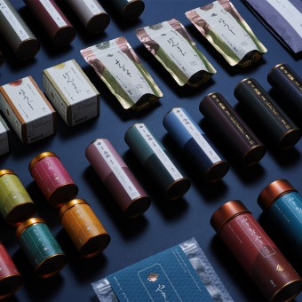
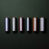
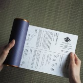
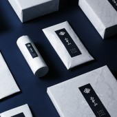
| DESIGN NAME: Yamamotoyama PRIMARY FUNCTION: Rebranded Tea Package INSPIRATION: To rebrand YAMAMOTOYAMA, the aesthetic sense of the Edo period was the key. There was a unique culture of layering colours called Color Matching. For new packages, we selected from among the traditional Japanese colours based on the concept of that culture. The psychological impressions of the colours were chosen to reflect the taste and regional characteristics of the tea. The branding expresses the traditional tea culture as a bridge to connect tradition with the future. UNIQUE PROPERTIES / PROJECT DESCRIPTION: "YAMAMOTOYAMA&q OPERATION / FLOW / INTERACTION: - PROJECT DURATION AND LOCATION: - FITS BEST INTO CATEGORY: Packaging Design |
PRODUCTION / REALIZATION TECHNOLOGY: - SPECIFICATIONS / TECHNICAL PROPERTIES: - TAGS: - RESEARCH ABSTRACT: - CHALLENGE: - ADDED DATE: 2021-02-22 06:35:36 TEAM MEMBERS (4) : Art Direction: NOSIGNER (Eisuke Tachikawa) , Graphic Design: NOSIGNER (Eisuke Tachikawa, Ryota Mizusako) , Client: YAMAMOTOYAMA Co.,Ltd. and IMAGE CREDITS: Photography: Sato Kunihiko |
||||
| Visit the following page to learn more: https://www.yamamotoyama.co.jp/index.htm |
|||||
| AWARD DETAILS | |
 |
Yamamotoyama Rebranded Tea Package by Eisuke Tachikawa is Winner in Packaging Design Category, 2020 - 2021.· Press Members: Login or Register to request an exclusive interview with Eisuke Tachikawa. · Click here to register inorder to view the profile and other works by Eisuke Tachikawa. |
| SOCIAL |
| + Add to Likes / Favorites | Send to My Email | Comment | Testimonials | View Press-Release | Press Kit | Translations |


