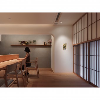
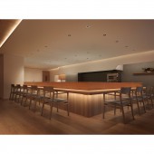
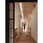
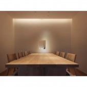
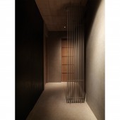
Sho Restaurant by Variety Enterprise Co., Ltd |
Home > Winners > #119459 |
| CLIENT/STUDIO/BRAND DETAILS | |
 |
NAME: Variety Enterprise Co., Ltd PROFILE: Variety Enterprise Co., Ltd. sublimates dining into an important part of life experience; they provide high-quality dining experience that has never been seen in the local area. Improving the food culture and using the power of catering to make the city international are Variety Enterprise’s aim to give back to Taiwan. Sho is the Taiwan-based branch of Den. It is hoped to cultivate local talents and increase the self-demand of catering through the Japanese leading chef, Zaiyu Hasegawa. |
| AWARD DETAILS | |
 |
Sho Restaurant by Variety Enterprise Co., Ltd is Winner in Interior Space and Exhibition Design Category, 2020 - 2021.· Read the interview with designer Variety Enterprise Co., Ltd for design Sho here.· Press Members: Login or Register to request an exclusive interview with Variety Enterprise Co., Ltd. · Click here to register inorder to view the profile and other works by Variety Enterprise Co., Ltd. |
| SOCIAL |
| + Add to Likes / Favorites | Send to My Email | Comment | Testimonials | View Press-Release | Press Kit |
Did you like Variety Enterprise Co., Ltd's Interior Design?
You will most likely enjoy other award winning interior design as well.
Click here to view more Award Winning Interior Design.


