Alienergy Energy Drink Functional Beverages by Genki Forest |
Home > Winners > #119239 |
 |
|
||||
| DESIGN DETAILS | |||||
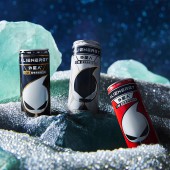
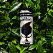
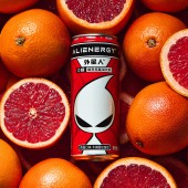
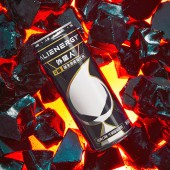
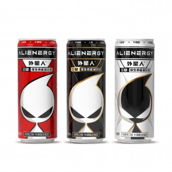
| DESIGN NAME: Alienergy Energy Drink PRIMARY FUNCTION: Functional Beverages INSPIRATION: Alienergy is the first brand in China to create an energy drink without sugar. Our two main goals are highlighting the brand identity and emphasizing the strong function of our energy drink. We think that alien is an appropriate metaphor for the unknown power so we designed around it. The identity is simple enough that it will be easy to memorize, also intriguing for consumers to imagine the whole profile of it. UNIQUE PROPERTIES / PROJECT DESCRIPTION: The Alien figure is the extension of the logo, by emphasizing the character enables the brand to have a strong connection with this bold mark. Alienergy considered to keep this character as a symbol for the whole energy drink product line. The brand chose a much clean palette and make use of the metal shine for popping accents. Combined with the information hierarchy of emphasizing sugar free, the design distinguishes the product from competitors and expresses the brand attitude of innovation. OPERATION / FLOW / INTERACTION: The slim can shape helps the product stand out on the shelf in current retail scenarios and creates a better holding experience for our customers. The 330 ml net weight is also by design. For the brand's flagship product line, this product caters to a larger audience in the energy market and this can size has withstood the test of market. Most customers can finish this drink in one sitting in a comfortable pace without having to carry it by hand. PROJECT DURATION AND LOCATION: The project started in June, 2020 and completed on October 2020. The design was completed in Beijing, China. The production location is Shanghai, China. FITS BEST INTO CATEGORY: Packaging Design |
PRODUCTION / REALIZATION TECHNOLOGY: When we are facing the challenge that plastics bring globally, aluminum became the obvious solution for efficient recycling and repurposing. Alienergy firmly believes that companies today are obligated to help spread the message and values. SPECIFICATIONS / TECHNICAL PROPERTIES: Width 58mm x Depth 58mm x Height 142mm TAGS: Branding, Packaging, Can, 3D, Energy drink RESEARCH ABSTRACT: In the current market especially after the pandemic, the trend of health consciousness is rising. We wanted to create a revolutionary product that meets this demand. We conducted surveys both online and offline for the importance of sugar free and the preference of aesthetics in designs after the preliminary stage. Each question were designed to test out our design or unique product features against real competitors in the market side by side, thus be more grounded in our analysis and results. We have more confidence to have science back up our product and packaging design. CHALLENGE: This entry is actually our second generation of design. The main challenge we face is that the first Alienergy design has a more natural aesthetic with green and white as the main color scheme. It didn't differentiate enough from the market place and we wanted a more powerful and impactful design but still stay true to our brand concept. This current design features no concrete representation of nature and flavor such as tea leaves or fruits, only strait lines, geometric shapes and more contrasting colors to solidify a more energetic impression on customers. ADDED DATE: 2021-02-20 06:37:18 TEAM MEMBERS (6) : Logo type design: Gang Wang, Jiaqi Liu, Logo mark design: Xiaolan Xiao, Packaging design: Xiaolan Xiao, Tianyun Liu and Prepress: Xiaolan Xiao IMAGE CREDITS: Creator: Gang Wang PATENTS/COPYRIGHTS: Label Patent:202030509836.0 , 2020, China. |
||||
| Visit the following page to learn more: http://www.yuanqisenlin.com/ | |||||
| AWARD DETAILS | |
 |
Alienergy Energy Drink Functional Beverages by Genki Forest is Winner in Packaging Design Category, 2020 - 2021.· Press Members: Login or Register to request an exclusive interview with Genki Forest. · Click here to register inorder to view the profile and other works by Genki Forest. |
| SOCIAL |
| + Add to Likes / Favorites | Send to My Email | Comment | Testimonials | View Press-Release | Press Kit |

