SuNeungDokHae Reading Solutions Brand by Jaehun Kim |
Home > Winners > #118983 |
 |
|
||||
| DESIGN DETAILS | |||||
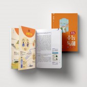
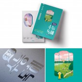
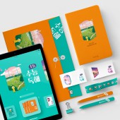
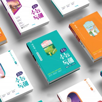
| DESIGN NAME: SuNeungDokHae PRIMARY FUNCTION: Reading Solutions Brand INSPIRATION: Essential value of the brand is its dedication to the process of finding joy in learning. Visang visualizes this process through the motif of a window. The world seen through the window depicts the essential stories contained within each book. The material in each chapter is related to the background images viewed through the window. In this way, the lessons can be engagingly studied, and the image of a brand identity that embraces the joy of learning is consistently applied throughout the work. UNIQUE PROPERTIES / PROJECT DESCRIPTION: SuNeungDokHae is a professionally crafted learning brand for improving reading comprehension on the CSAT by deeply analyzing the language section. This resource of brand identity stems from its trademark series of illustrations that directly reflect the target learning content. Through a deliberate color system, this series separates the fields of study between elementary and middle school students and utilizes its infographic design to both visually and cognitively elucidate learning content. OPERATION / FLOW / INTERACTION: SuNeungDokHae is a reading comprehension learning brand developed for self directed study. Through gorgeous illustrations and an infographic design that can stir the learner’s emotional connection to the literary works, the series aims to reduce the weight of advanced level learning and to promote the perseverance needed for self motivated study. PROJECT DURATION AND LOCATION: The SuNeungDokHae Project was conducted in Seoul, South Korea. The brand for improving reading comprehension on the College Scholastic Ability Test by deeply analyzing the language section was developed from June to December 2020. FITS BEST INTO CATEGORY: Graphics, Illustration and Visual Communication Design |
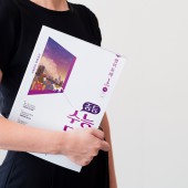
PRODUCTION / REALIZATION TECHNOLOGY: Visang designed the cover of the work to stimulate the learners imagination through illustrations that enable the students to infer the learning topics in advance. Additionally, the interior composition features an infographic design that allows for content to be understood visually and cognitively, instead of only being passively read. In this way, the SuNeungDokHae brand differentiates itself from its peers. SPECIFICATIONS / TECHNICAL PROPERTIES: After consideration of the physical characteristics of its teenage readers, SuNeungDokHae is sized with dimensions of 220mm * 280mm * 7mm for easy transportation, and the corners are rounded for safety. To create positive aesthetics, Visang used spot coloring printing and an iridescent finish both based on the overall brand color system. TAGS: Reading Comprehension, korean, CSAT, student RESEARCH ABSTRACT: Visang prioritized vocabulary and reading comprehension as foundational study skills without which multi-disciplinary learning ability would be compromised. The SuNeungDokHae Project aims to aid students in efficiently learning high-level reading content. Visang utilizes infographics to explain challenging content so that students can better visualize their studies. This has resulted in the successful launch of the brand, allowing it to support self-directed learning of CSAT reading content. CHALLENGE: The greatest challenge was designing exceptional academic material that empowers learners to enjoy self-directed study without fear. To that end, various design methods were employed so that students would be able to read the CSAT learning content without burden. The infographics help students grasp the learning goals at a glance, present familiar characters, and apply warm and gentle colors to the content so that students can pursue the learning process without any pressure. ADDED DATE: 2021-02-18 05:38:36 TEAM MEMBERS (7) : Creative Director : Ryeoeun Jung, Designer : Sehee Lim, Designer : Jiin Yu, Designer : Sujung Jang, Designer : Young Hyun Kim, Designer : Youn Seok Choi and Designer : Ji Sun Park IMAGE CREDITS: VISANG |
||||
| Visit the following page to learn more: http://bit.ly/2NhZfVB | |||||
| AWARD DETAILS | |
 |
Suneungdokhae Reading Solutions Brand by Jaehun Kim is Winner in Graphics, Illustration and Visual Communication Design Category, 2020 - 2021.· Read the interview with designer Jaehun Kim for design SuNeungDokHae here.· Press Members: Login or Register to request an exclusive interview with Jaehun Kim. · Click here to register inorder to view the profile and other works by Jaehun Kim. |
| SOCIAL |
| + Add to Likes / Favorites | Send to My Email | Comment | Testimonials | View Press-Release | Press Kit |
Did you like Jaehun Kim's Graphic Design?
You will most likely enjoy other award winning graphic design as well.
Click here to view more Award Winning Graphic Design.


