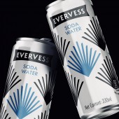
Evervess Soda Water Beverage by PepsiCo Design and Innovation |
Home > Winners > #118789 |
| CLIENT/STUDIO/BRAND DETAILS | |
 |
NAME: PepsiCo Design & Innovation PROFILE: PepsiCo products are enjoyed by consumers more than one billion times a day in more than 200 countries and territories around the world. PepsiCo generated more than $67 billion in net revenue in 2019, driven by a complementary food and beverage portfolio that includes Frito-Lay, Gatorade, Pepsi-Cola, Quaker and Tropicana. PepsiCo's product portfolio includes a wide range of enjoyable foods and beverages, including 23 brands that generate more than $1 billion each in estimated annual retail sales. |
| AWARD DETAILS | |
 |
Evervess Soda Water Beverage by Pepsico Design and Innovation is Winner in Packaging Design Category, 2020 - 2021.· Read the interview with designer PepsiCo Design and Innovation for design Evervess Soda Water here.· Press Members: Login or Register to request an exclusive interview with PepsiCo Design and Innovation. · Click here to register inorder to view the profile and other works by PepsiCo Design and Innovation. |
| SOCIAL |
| + Add to Likes / Favorites | Send to My Email | Comment | Testimonials | View Press-Release | Press Kit |
Did you like Pepsico Design and Innovation's Packaging Design?
You will most likely enjoy other award winning packaging design as well.
Click here to view more Award Winning Packaging Design.


