Vilajuiga Lightly Sparkling Water Bottle by Mos |
Home > Winners > #118323 |
 |
|
||||
| DESIGN DETAILS | |||||
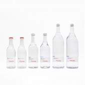
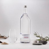
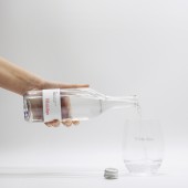
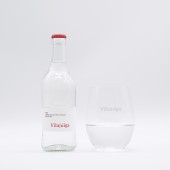
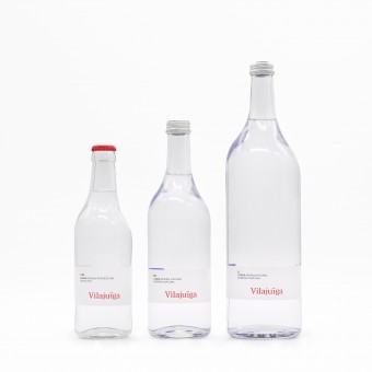
| DESIGN NAME: Vilajuiga Lightly Sparkling Water PRIMARY FUNCTION: Bottle INSPIRATION: The design stands out for its asymmetry and the organic shapes that show its "Emporda" origin. The changing geological environment and the territory modelled by the tramuntana wind, with rocks eroded, has inspired the bottle design. UNIQUE PROPERTIES / PROJECT DESCRIPTION: Unique, rare, and singular, a naturally carbonated mineral water (no added carbon dioxide). The shape becomes simple, discreet and at the same time innovative. Due to the pureness and the high transparency of the glass and the blue of the label, it slightly makes some blue shades in the bottle. Thanks to its geometry, depending from which perspective you look at the bottle, you perceive several shapes. OPERATION / FLOW / INTERACTION: The long neck of the bottle makes the water flow impeccably and helps the professionals because it's perfect for carrying many bottles at the same time. Also, its heaviness helps them when the bottles are on a tray. In this product the real benefit comes from the product itself. Vilajuiga water was catalogued as a medicinal water. The label and the pure transparent glass want to reflect these characteristics. PROJECT DURATION AND LOCATION: The project started in 2018 in Catalonia, Spain and finished in 2020 in Catalonia, Spain. FITS BEST INTO CATEGORY: Packaging Design |
PRODUCTION / REALIZATION TECHNOLOGY: The material is 100% white glass, pure transparency. Short and limited production. Bottle produced in Italy and labeled in Catalonia. SPECIFICATIONS / TECHNICAL PROPERTIES: Diameter: 65mm / Height: 220mm TAGS: Vilajuiga, Water, Bottle, Beverage, Drinks, Packaging, Product RESEARCH ABSTRACT: Historical research, water quality, type of materials, forms, environment, etc. The objective was to understand the 100 years of the company and the new owner capabilities. The participants where technicians, cooks, elderly town citizens, etc. The result was the new bottle, accepted for all, the consumers, the new owners, the cooks, the society. CHALLENGE: The hardest part of this project was creating a link between the new brand, Vilajuiga and the owner brand, Grifols. Grifols is a pharmaceutical company that has as their values the quality and safety of their products, also its brand color blue. So we had to create a packaging that reflects this pharmaceutical pureness and quality. So we selected 100% white glass, for its impeccable transparency. Also, in the two bigger bottles, we introduce Grifols blue brand color in the inner part of the label. This had two main ideas, to make Grifols even more part of the brand, and also to make some blue shades in the bottle. ADDED DATE: 2021-02-12 11:13:31 TEAM MEMBERS (2) : David Grifols, and David Roselló. IMAGE CREDITS: Design number 004677474-0001 Owner ID number 884150 PATENTS/COPYRIGHTS: Design number: 004677474-0001, Class number 09.01, Owner ID number 884150. |
||||
| Visit the following page to learn more: http://bit.ly/3dkNDKG | |||||
| AWARD DETAILS | |
 |
Vilajuiga Lightly Sparkling Water Bottle by Mos is Winner in Packaging Design Category, 2020 - 2021.· Press Members: Login or Register to request an exclusive interview with Mos. · Click here to register inorder to view the profile and other works by Mos. |
| SOCIAL |
| + Add to Likes / Favorites | Send to My Email | Comment | Testimonials | View Press-Release | Press Kit |

