DESIGN NAME:
Lezai Dental Clinic
PRIMARY FUNCTION:
Logo and Brand Identity
INSPIRATION:
LEZAI Dental Clinic is a comprehensive dental clinic with a joyful and warm environment, which has a special focus on women and children and coveys the brand concept of the joy in this moment. In order to highlight the clinic's brand image of sense of security + joy + professionalism, in the process of designing the brand logo, we have introduced the concept of Joy in the teeth which (in Chinese) is phonetically similar with and coincides with the concept of the joy in this moment.
UNIQUE PROPERTIES / PROJECT DESCRIPTION:
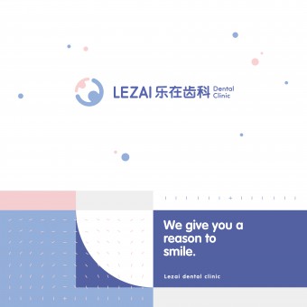
The logo as a whole is applied with the inversion technique of graphic bottom in graphic design, which is to form a visual symbol with positive and negative shapes. The positive shape is formed with simple long and short straight lines combined with circle to outline a safe and joyful scene where adults and children hug and hold hands in a circle. And the negative shape in the middle takes the form of a tooth which presents the brand concept of joy in the teeth.
OPERATION / FLOW / INTERACTION:
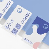
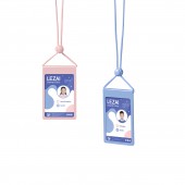
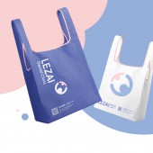
The logo suggests the design philosophy and core values of the brand. It conveys the idea that women and children embrace dental health. The low-saturation brand colors create a relaxed and warm feeling, while the combined logo are used to convey the brand image of security, joy, and professionalism.
PROJECT DURATION AND LOCATION:
The project started in October 2019 and finished in February 2020 in Guangzhou.
FITS BEST INTO CATEGORY:
Graphics, Illustration and Visual Communication Design
|
PRODUCTION / REALIZATION TECHNOLOGY:
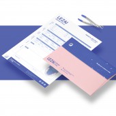
To create a consistent visual system, all the necessary PMS color codes were provided for printed and digital media. In addition, RAL equivalents of these colors and fabric colors were also selected for the interior clinic space.
SPECIFICATIONS / TECHNICAL PROPERTIES:
The logo and visual system are designed in vector format to make it suitable for different sizes of digital and printed media. In order to prevent the mis-production of any items, we have prepared a comprehensive brand logo guidelines manual.
TAGS:
Logo, Branding, Packaging, Visual Identity, Graphic Design, Interior Design
RESEARCH ABSTRACT:
Before commencing on this project, we conducted in-depth research on the logo, visual identity, and graphic design of other dental clinics in the market. The research results show that the logos of dental clinics industry exhibit serious homogeneity and lacks brand uniqueness. Therefore, in our brand strategy, we have formulated a brand image of "Happy First, Warm Treatment", so that consumers can clearly feel the service characteristics and harmonious interactions conveyed by the brand.
CHALLENGE:
The challenge mainly lies in how to find a design language that can not only express the attributes of the dental clinics industry, but also interpret the brand connotation, so that consumers can get a better brand experience.
ADDED DATE:
2021-02-05 08:40:14
TEAM MEMBERS (3) :
Creative Director: Zhiji Dong, Designer: Lu Gu and
IMAGE CREDITS:
Guangzhou Cheung Ying Design Co., Ltd., 2020.
|
