Prakrishi Dry Fruits Packaging by Vishal Vora |
Home > Winners > #117439 |
 |
|
||||
| DESIGN DETAILS | |||||
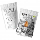
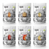
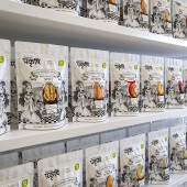
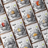
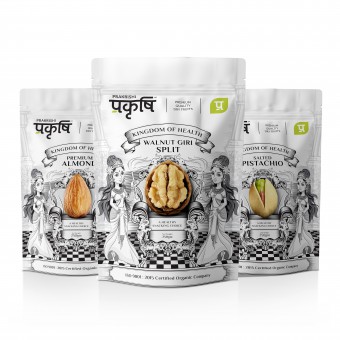
| DESIGN NAME: Prakrishi PRIMARY FUNCTION: Dry Fruits Packaging INSPIRATION: Dry Fruit Is King Of Food And Health, There Is One Phrase That We Become What We Eat, When We Eat Healthy Food We Surely Lead A Healthy Life, Our Intended Design Strategy Was To Create A Packaging That Tells A Story of Kingdom Of Health Where Each Dry Fruit Is Depicted As A King Of Its Kingdom, Consumer Will Surely Love To Live In This Kingdom Of Health. We Created A Packaging Range With Strong Shelf Appeal and hook; Monochromatic Packaging With Each Dry Fruit Is Portrayed In Color As Strong Differentiator. UNIQUE PROPERTIES / PROJECT DESCRIPTION: Challenge was to create range of dry fruit packaging with strong visual narrative meant for Indian market, we created a packaging range with strong visual story of dry fruits on shelf where hundreds of products are fighting for attention. OPERATION / FLOW / INTERACTION: Most challenging part of design is to understand scientific description of people and culture with their custom and habits based on that data entire design exercise took place and we succeeded to connect the consumer emotionally with a clear brand story. PROJECT DURATION AND LOCATION: The project started in July 2020 in India and finished in December 2020 in India FITS BEST INTO CATEGORY: Packaging Design |
PRODUCTION / REALIZATION TECHNOLOGY: Swiss Pack Zip Lock Packaging With 4 Color Printing SPECIFICATIONS / TECHNICAL PROPERTIES: Width 140mm X Height 210mm TAGS: Savoury Snacks, Dry Fruits, Nuts, Healthy Foods, Packaging Design, Communication Design, RESEARCH ABSTRACT: Understand the consumer mind set and need of the very market it is going to sell, CHALLENGE: Hardest Part Of This Packaging Was To Crack Right Approach For Design At The Same Time Have A Strong Visual Appeal On Shelf. ADDED DATE: 2021-02-04 11:12:19 TEAM MEMBERS (1) : Vishal Vora and Team IMAGE CREDITS: Vishal Vora and Team |
||||
| Visit the following page to learn more: http://prakrishiorganic.com/ | |||||
| AWARD DETAILS | |
 |
Prakrishi Dry Fruits Packaging by Vishal Vora is Winner in Packaging Design Category, 2020 - 2021.· Press Members: Login or Register to request an exclusive interview with Vishal Vora. · Click here to register inorder to view the profile and other works by Vishal Vora. |
| SOCIAL |
| + Add to Likes / Favorites | Send to My Email | Comment | Testimonials | View Press-Release | Press Kit |

