DESIGN NAME:
The Kungfu Froggy
PRIMARY FUNCTION:
Restaurant
INSPIRATION:
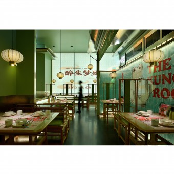
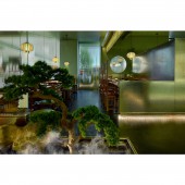
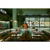
The concept of "garden" is used in this case, which uses a more diversified design language to transform abstract artistic expression into perceptible spatial images, and integrates traditional elements such as bamboo and stone, as well as modern materials such as glass, terrazzo, and stainless steel chrome plates to fully interpret the beauty of harmony through ancient and modern times.
UNIQUE PROPERTIES / PROJECT DESCRIPTION:
The artistic structure is also the focus of the design and planning of this project. At the same time, as the actual use intention of the restaurant, the far-reaching significance of its comfort and experience in the project is self-evident. The dining area uses the smooth moving line and functions between the spaces to provide enough choice space for the diversified dining needs of diners, which not only effectively improves the utilization rate of the space and maximizes the value.
OPERATION / FLOW / INTERACTION:
The transition of landscape and materials interprets the collision between man-made and nature, with the frog shape at the door head, it can not only satisfy the freshness and value of the novelty seeking experience of diners, but also represent the spiritual orientation and aesthetic taste of modern people.
PROJECT DURATION AND LOCATION:
The project started in June 2019 in Nanning and finished in October 2019 in Nanning.
FITS BEST INTO CATEGORY:
Interior Space and Exhibition Design
|
PRODUCTION / REALIZATION TECHNOLOGY:
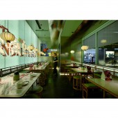
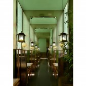
Tracing back to the origin of the project, the designer annotates the artistic context of architecture with a sequential viewing rhythm. The intervention of large-scale floor-to-ceiling glass makes the space get a good division. At the same time, it is interspersed with metal elements, which not only has the traditional aesthetic feeling, but also has the flavor of fashion.
SPECIFICATIONS / TECHNICAL PROPERTIES:
The project covers a total of 300 square meters.
TAGS:
Interior, Commercial, Restaurant, Kung Fu, Garden, Elegant, Natural
RESEARCH ABSTRACT:
The garden space emphasizes precise visual axis direction and proportional control, providing people with different perspectives and constantly changing and continuing mobility perspectives. Starting from the entrance of the space, the glossy and modern partitions look like fish scales texture, giving full play to the dialogue between the building and the space.
CHALLENGE:
The core of this case design is how to carry out brand differentiation positioning and create a unique brand image through the cross-border integration of IP and space.
ADDED DATE:
2021-01-22 08:35:18
TEAM MEMBERS (4) :
Xiaoguo Rui , Bin Shen, Pengfei Zheng and Zhen Fang
IMAGE CREDITS:
Image #1: Photographer Erqing Li, Variations, 2019.
Image #2: Photographer Erqing Li, Variations, 2019.
Image #3: Photographer Erqing Li, Variations, 2019.
Image #4: Photographer Erqing Li, Variations, 2019.
Image #5: Photographer Erqing Li, Variations, 2019.
PATENTS/COPYRIGHTS:
Copyrights belong to Erqing Li, 2019.
|
