Krafton Brand Experience Design by Plus X |
Home > Winners > #115949 |
 |
|
||||
| DESIGN DETAILS | |||||
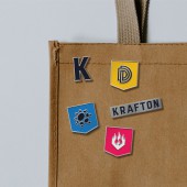
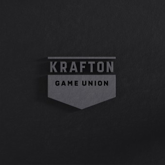
| DESIGN NAME: Krafton PRIMARY FUNCTION: Brand Experience Design INSPIRATION: Krafton has built its logo design system that can express both the uniqueness and consistency of each alliance brand after being inspired by the crest of the Craft Guild of the Middle Ages. UNIQUE PROPERTIES / PROJECT DESCRIPTION: Krafton has built its logo design system that can express both the uniqueness and consistency of each alliance brand to reestablish the brand architecture. This highlights the IP products provided by Krafton to enable investors and the public to easily access them and modularizes them for the improvement of management efficiency against issues. OPERATION / FLOW / INTERACTION: The shield-shaped frame indicates “the symbol of a guild in the Middle Ages.” The use of the frame can convey Krafton's brand identity, which is like a guild of game development with various game developers, so that it is easy to expand the meaning and that it can be used in all touchpoints such as forms, icons, and advertisements. PROJECT DURATION AND LOCATION: The project proceeded for 9 months in Seoul, South Korea. FITS BEST INTO CATEGORY: Graphics, Illustration and Visual Communication Design |
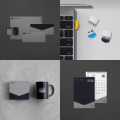
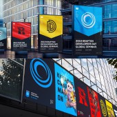
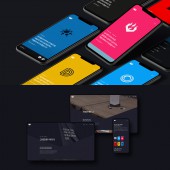
PRODUCTION / REALIZATION TECHNOLOGY: 1. Brand Value Platform Krafton's essence is defined as UNGRAVITY. 2. Visual Identity and Brand Design Element Development Krafton's brand identity is expressed by visualizing a shield-shaped frame, which is the basic form of a guild crest. 3. Brand Experience Design From all touchpoints, key visual assets such as logos, colors, typefaces, and key visuals are used in the right places to provide Krafton's differentiated brand experiences. SPECIFICATIONS / TECHNICAL PROPERTIES: Application It is designed in various ways by applying the formative characteristics of the symbol. With soft semigloss or matte materials, a heavy and solid feeling is provided. e.g., business cards, forms, USBs, cups, calendars, wappens, etc. TAGS: Game Union, Ungravity, Maximizing The Creative, Diversity In Unity, Pure Challenge RESEARCH ABSTRACT: Through internal interviews, it is found that the “hole” of the existing verbal asset has a negative impression in English-speaking countries. Thus, we thought that the association was a major risk to the company’s goal to enter global markets. In addition, research on the corporate structure of an alliance of diverse development studios and the characteristics, philosophy, direction of the alliance were conducted. Through this process, Krafton was created as a new name. CHALLENGE: It was difficult to establish a logo design system that could express both the uniqueness of each of Krafton's associated brands and the consistency of the group’s brand. However, with the goal of expressing the value of “independence and cooperation” pursued by Krafton, we have built a design system that simultaneously shows the integrated image of the group brand and the unique image of each union company. ADDED DATE: 2021-01-15 07:05:37 TEAM MEMBERS (22) : Plus X Creative Director: Myungsup Shin, Plus X Creative Director: Sabum Byun, Plus X Creative Director: Jangsoon Choe, BX Strategist: Jisu Kim, BX Strategist: Bohyun Kook, BX Strategist: Minho Jang, BX Designer: Wonsik Joo, BX Designer: Suji Choi, BX Designer: Jihoon Noh, BX Designer: Hyunmin Han, UX Designer: Yoojin Jeon, UX Designer: Dongbeen Choi, UI Designer: Kiwon Jang, UI Designer: Chulhee Kim, UI Designer: Hyungyu lee, UI Interaction Designer: Chulhee Kim, Developer: Gmo Song, Developer: Jeonghyuck Won, Developer: Mira Jung, Developer: Minju Kim, Brand Movie designer: Wonsik Joo and Brand Movie designer: Kwangmyung Lim IMAGE CREDITS: Plus X PATENTS/COPYRIGHTS: Copyrights belong to Plus X Co. |
||||
| Visit the following page to learn more: https://bit.ly/3bs7Jmg | |||||
| AWARD DETAILS | |
 |
Krafton Brand Experience Design by Plus X is Winner in Graphics, Illustration and Visual Communication Design Category, 2020 - 2021.· Press Members: Login or Register to request an exclusive interview with Plus X . · Click here to register inorder to view the profile and other works by Plus X . |
| SOCIAL |
| + Add to Likes / Favorites | Send to My Email | Comment | Testimonials | View Press-Release | Press Kit |

