The Journey of Arita Book Design by Sunghoon Kim |
Home > Winners > #115944 |
 |
|
||||
| DESIGN DETAILS | |||||
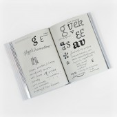
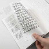
| DESIGN NAME: The Journey of Arita PRIMARY FUNCTION: Book Design INSPIRATION: The design development for the Arita font was carried out with the motif of healthy beauty, femininity, and modernity while being inspired by an elegant lady emerging in the classic poetry of Confucius, the ancient Chinese philosopher. The graceful and sophisticated impression of an elegant lady was beautifully embodied in soft curves, gentle strokes, and curvaceous forms, fully reflecting the movement of handwriting. UNIQUE PROPERTIES / PROJECT DESCRIPTION: The book The Journey of Arita covers everything related to the Arita font, which has long been veiled, encompassing how the corporate typefaces were born, the story behind the font design, cases where these typefaces were used, interviews with 14 of the designers involved in the design per font, documentary photographs showing the process of creating typefaces, and products and books that use the Arita font. OPERATION / FLOW / INTERACTION: Since the entire text of this book used the Arita font, readers can actually assess the usability of Arita while reading. For the overseas readers interested in Korean typography, this book was written in English alongside Korean. In addition, an understandable description of technical details on typefaces is enough to appeal to not only typographic designers but readers who have paid attention to the Arita font. PROJECT DURATION AND LOCATION: The project started in January 2019 in Paju and finished in August 2020 in Seoul, Korea FITS BEST INTO CATEGORY: Graphics, Illustration and Visual Communication Design |
PRODUCTION / REALIZATION TECHNOLOGY: The work was offset printing and a hardback, paper binding, thermo-gluing was used. The cover has been coated with skin texture. There is a ribbon bookmark with Arita in Korean, English, and Chinese characters. From Giyeok to hieut 14 Korean consonants were expressed on paper as embossing. A sketch and test process of the font are printed on a small piece of 125 x 170 mm paper and inserted into the book. The text was printed on matte paper and the photo was printed on glossy paper. SPECIFICATIONS / TECHNICAL PROPERTIES: 185 x 250 mm, 280 page, hardback, hot foil stamping processing on cover, the page format allowed the calculation of a multi-level grid for the composition of individual elements TAGS: graphic, graphic design, design, editorial, typography, book, book design, brand design, branding, font, type design, arita RESEARCH ABSTRACT: For the creation of a corporate font, it is generally common to entrust a typographic designer with a design of only the required typefaces within a short time. Even in an interview with a designer in the book, the designer says that it is uncommon to take 16 years to complete the development of a font in the typographic design industry where designers commissioned to create a font in only one month are commonplace. The Arita font is the product of much hard work of Amorepacific, which steadily oversaw the project without having any complaints and gave it consistent support for 16 years. Moreover, the designers developed the typeface focusing on usability so that their client as well as other designers and even the general public could use it effortlessly, and extended the typeface to branch out into a complete typeface family. The Arita font was developed as the company’s exclusive font, but all of its typefaces are available to anyone free of charge only if the copyright information is displayed. This reflects the company’s aspiration to emphasize the value of cultural sharing through the free distribution. CHALLENGE: The book The Journey of Arita also covers a story that makes us reflect on a unique facet, along with stories about typographic design. That is the importance in developing Korean terminology. Noticeably, the names of Arita typefaces stem from the Korean language, such as buri and chuim. In fact, it is not easy to develop Korean terms for each font in the typographic design industry where foreign words have usually been adopted to coin terms. In that sense, Arita project designers’ efforts to develop and use Korean terms for a better understanding of users should not be neglected. Furthermore, the book introduces an interesting story of how domestic designers worked collaboratively with designers from foreign countries, including China and the Netherlands, in an attempt to create the Roman alphabet and Chinese character typefaces. The Arita font truly contains many stories on a long journey towards the completion of its creation. If you follow the long journey of Arita from sowing seeds to growing magnificent trees with the book The Journey of Arita, you will come to understand how the Arita typefaces could be created to be used effortlessly in everyday life. ADDED DATE: 2021-01-15 01:01:26 TEAM MEMBERS (2) : Design Firm: ahn graphics and Creative Director: Sunghoon Kim, Art Director: Mano An, Designer: Sunghoon Kim, Mano An, Yuseon Park, Hyojung Yang IMAGE CREDITS: ahn graphics |
||||
| Visit the following page to learn more: https://www.apgroup.com | |||||
| AWARD DETAILS | |
 |
The Journey of Arita Book Design by Sunghoon Kim is Winner in Print and Published Media Design Category, 2020 - 2021.· Read the interview with designer Sunghoon Kim for design The Journey of Arita here.· Press Members: Login or Register to request an exclusive interview with Sunghoon Kim. · Click here to register inorder to view the profile and other works by Sunghoon Kim. |
| SOCIAL |
| + Add to Likes / Favorites | Send to My Email | Comment | Testimonials | View Press-Release | Press Kit |
Did you like Sunghoon Kim's Print Design?
You will most likely enjoy other award winning print design as well.
Click here to view more Award Winning Print Design.


