Niuniu Western Food Restaurant Space by Mingbin Yang |
Home > Winners > #115864 |
 |
|
||||
| DESIGN DETAILS | |||||
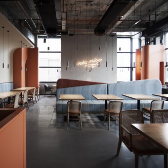
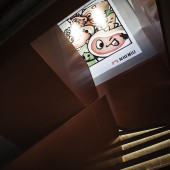
| DESIGN NAME: Niuniu Western Food PRIMARY FUNCTION: Restaurant Space INSPIRATION: The most three-dimensional layers and the most beautiful colors all come from the natural world, and a variety of rich elements form different emotional expressions, which please our mood. UNIQUE PROPERTIES / PROJECT DESCRIPTION: Re-enhance the concept of reverence for the natural world; show the brand color system more nakedly, and easily interact and dialogue with us in a more direct way. The orange in the space is the main color of NIU NIU WESTERN FOOD. It blends with the earth gray and sky blue in nature. It touches our resonance with visual senses, and once again speaks for the awe of nature. OPERATION / FLOW / INTERACTION: The wall uses pure childlike strokes to create a family portrait of "Niu Niu". The brand new visual IP image brings us here, meets here, and party here... PROJECT DURATION AND LOCATION: The project started in May 2020 in Foshan and finished in December 2020 in Jiangmen. FITS BEST INTO CATEGORY: Interior Space and Exhibition Design |
PRODUCTION / REALIZATION TECHNOLOGY: Paint, metal, stone, tile. SPECIFICATIONS / TECHNICAL PROPERTIES: 400sqm TAGS: Naturally, brand identity RESEARCH ABSTRACT: The practice of brand culture and visualization system in space. CHALLENGE: Investment cost is limited. ADDED DATE: 2021-01-13 10:05:27 TEAM MEMBERS (1) : MINGBIN YANG, RUIBAO ZENG&HONIDEA DESIGN LAB. IMAGE CREDITS: HONIDEA&NIU NIU WESTERN FOOD |
||||
| Visit the following page to learn more: http://www.honidea.com | |||||
| AWARD DETAILS | |
 |
Niuniu Western Food Restaurant Space by Mingbin Yang is Winner in Interior Space and Exhibition Design Category, 2020 - 2021.· Press Members: Login or Register to request an exclusive interview with Mingbin Yang. · Click here to register inorder to view the profile and other works by Mingbin Yang. |
| SOCIAL |
| + Add to Likes / Favorites | Send to My Email | Comment | Testimonials | View Press-Release | Press Kit |


