DESIGN NAME:
Self Portrait
PRIMARY FUNCTION:
Office
INSPIRATION:
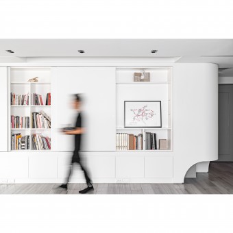
This project is located in a 30-year-old mixed-used residential and commercial building. Considering the new traffic flow and functions needed by the client, the overall space is re-planned, by the cabinet and the island table, the space becomes larger and more functional. The pure color arrangement expresses an open and bright spatial characteristic, and using arc design vocabulary to create an extended and progressive harmony in a smooth and continuous surface.
UNIQUE PROPERTIES / PROJECT DESCRIPTION:
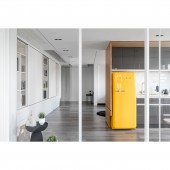
In the process of rebuilding the old office, since the space is quite small and the buildings beam height is low, the layout follows the concept of One Room / One Space / One Object, meaning that all the spatial elements are connected. The design method of considering the space element as a continuous and single object, not only enlarges the feeling of the space but also centralized the primary functions. The kitchen is regarded as a Solid Cube located in the middle of the interior, which not only meets the needs of daily life but also distinguishes different attributes.
OPERATION / FLOW / INTERACTION:
Due to the clients work needs, spaces for placing books, leather tools, and materials are needed. Therefore, more accommodating and flexible working areas are required. By taking that into consideration, the designer builds a continuous curvy book wall for storing books as well as a wall and cabinet for displaying. The "One Room" design concept not only satisfies the need for segmenting the space because of different requirements, but the glass sliding door also can be opened when necessary to make space be used in continuity.
PROJECT DURATION AND LOCATION:
The project finished in March 2020 in Taichung City, Taiwan.
FITS BEST INTO CATEGORY:
Interior Space and Exhibition Design
|
PRODUCTION / REALIZATION TECHNOLOGY:
The colors and materials of the space are mainly monochromatic of gray and white, in order to minimize the interference of space design from life. The design team believes that the people living in the space are the protagonists so that rather than using tedious and complicated decorations, it is highlighting the life of the clients as the contrary. The colors and materials of the project reflect the real life of the space users so that the interior design can play a role to gather and reconcile life. The only color in the space is from the wooden plywood wall of the kitchen.
SPECIFICATIONS / TECHNICAL PROPERTIES:
In the ceiling design, the part of the space can be pushed up, which is like an extension of an infinite sky cave feeling. In addition to continuing the height of the cabinet to reduce the feeling of pressure, it also allows light to pass through the interior space in a softer way through the homogeneous refraction of the curved surface. The upward curved ceiling shape also matches the continuous horizontal straight lines and curved lines of the ceiling, as well as the curvy cabinet shape, the interior curve is displayed on the XYZ axis so that the shape of all components can be extended in a consistent and continuous manner.
TAGS:
One Room, One Room concept, Curved cabinet, Mixed-use building, Mirror material, Monochromatic
RESEARCH ABSTRACT:
Starting from the concept of One Room / One Space / One Object and seeing the space as a continuous division, the designer creates a harmonious life experience through connected curvy cabinets and curved vocabulary. In the ceiling design, part of the space is pushed up, in addition to continuing the height of the cabinet to reduce the feeling of pressure, it also allows light to pass through the interior space in a softer way through the homogeneous refraction of the curved surface and let the curve extends on the XYZ axis so that all components are consistent and continuous.
CHALLENGE:
Due to the limited space and the possibility of turning it into residential space in the future, it is necessary to consider the possibility of using it as residential space in the future. Therefore, there are multiple considerations in the design of how to balance the present and future functions. And through design techniques such as push up ceilings, mirrors, room layout compositions, creating an expanded spatial feeling, yet at the same time maintaining a pure spatial space is the biggest challenge.
ADDED DATE:
2021-01-11 02:36:50
TEAM MEMBERS (1) :
YUNG-EN LIN
IMAGE CREDITS:
YUNG-EN LIN
|


