DESIGN NAME:
Art and Chanson Overbrimming
PRIMARY FUNCTION:
Residential
INSPIRATION:
Yui Design has carefully measured the metric space and reorganized the flow line. Moreover, Taking the clients collection and furniture into account as well as injecting a new soul into it. Using wood look tiles, sintered stones, metal plates with low chroma colors such as black and white, establishing a modern and elegant space. Also, Merging with the idea of the gallery, the designer has created a romantic tone for the clients collection by displaying crystal pieces and a piano.
UNIQUE PROPERTIES / PROJECT DESCRIPTION:
Considering the clients living habits, the designer has eliminated unnecessary spaces so as to bring out a transparent ambiance. Also, making good use of combining different materials together, the designer has pulled out a string that connects to each domain. As to the living room, utilizing sintered stones to construct the walls and supplemented with rough junctions has not only manifested the main content with the area but also enhanced visual abundance. Furthermore, the designer has introduced rural mountain scenery into the private area by dismantling excessive iron stands along with the windows.
OPERATION / FLOW / INTERACTION:
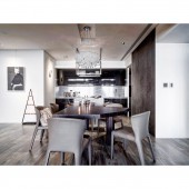
The flow line needs to not only bring out a different mood to space but also be functional for the client. The connection of each flow line from different domains has become one of the issues to the design plan. The designer has utilized the change between the materials of walls to imply the distinguishment of each area. The designer has linked the ambiance of the inner space together by displaying the chandelier on the top of the dining table and the match with the iron storage box for the crystal glasses which has extended the concept to the kitchen island as well as corresponds with the piano at the living room and the TV wall.
PROJECT DURATION AND LOCATION:
The project finished in February 2020 in Xindian, New Taipei City, Taiwan.
FITS BEST INTO CATEGORY:
Interior Space and Exhibition Design
|
PRODUCTION / REALIZATION TECHNOLOGY:
The designer has established the space with wood look tiles, sintered stones, and metal plates with natural materials such as white painted woodworks. Also, based on the low chroma key vision, shuttling between the texture of wood and stone, with the beautiful lines of piano and delicate crystal illumination, space has created a new ambiance. As to the TV wall, it is constructed with metal materials. In addition to the neat lines concealing behind the door, it is extended to the ceiling through the beams which imply the reflection character of the mirror metal and the expansion of the inner space.
SPECIFICATIONS / TECHNICAL PROPERTIES:
The plan has preserved a lot of the clients collection, furniture, and piano. Therefore, the connection between the spirit of the client and these functional or display items has become a goal for the designer. Taking the TV wall as an example, the designer has used low chroma colors such as black and white to inject a sense of serenity into the ambiance, supplemented with the grey color canvas as the underlayment and the display of crystal lamps and piano. However, the shimmering lights projecting from the crystal have reflected on the sintered stones and the piano which is like the old memories are on top of the present.
TAGS:
Simplicity, Concept of galley, Metal slabs, Sense of transparency
RESEARCH ABSTRACT:
The designer has carefully measured the metric space and taken the needs of the clients into consideration such as the demolition of unnecessary walls so as to broaden the public area. The designer has utilized metal slabs, wood walls to establish the texture of simplicity. Moreover, using lines to conceal the storage spaces so that the collection of clients can be well preserved. Also, infusing the concept of galley into the plan, using metal slabs to construct the display cabinets, and matching with the crystal items have created a sense of artistic living space.
CHALLENGE:
The harmony between the new ideas and the clients collection, also the spirit of the client has become a challenge to the plan. Therefore, in order not to affect the space ambiance, the designer has only displayed a few collections and utilized low chroma color to connect with the trace of the calm memories.
ADDED DATE:
2021-01-11 01:18:06
TEAM MEMBERS (2) :
Hung-Yu Chen and Yi-Chia Kao
IMAGE CREDITS:
Yu [ i ] Design Studio
|


