SkyGrid Aerial Vehicle Management by Milton Lopez and Henry Han |
Home > Winners > #115280 |
 |
|
||||
| DESIGN DETAILS | |||||
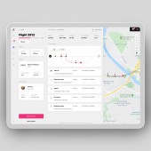
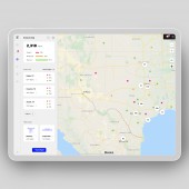
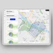
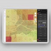
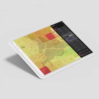
| DESIGN NAME: SkyGrid PRIMARY FUNCTION: Aerial Vehicle Management INSPIRATION: The product design was inspired by current software used by air traffic control staff. Looking at the air traffic control experience allowed me to understand what struggles the staff have. Video game dashboards were also examined to get inspirations on how to create the most efficient dashboard. UNIQUE PROPERTIES / PROJECT DESCRIPTION: Co-founded by Boeing and Austin-based AI company SparkCognition, SkyGrid aims to enable autonomous aerial traffic operations, by using AI to enable self-regulated aerial traffic. For flight operators, I created the product experience that enable seamless flight creations and management. In detail, the product provides flight, environmental, and regulatory data, to the user, to give a complete picture of the airspace. OPERATION / FLOW / INTERACTION: What makes SkyGrid a superb aerial operation product is its ability to give the pilot a complete picture of the airspace in real time, including area conditions, vehicle conditions, and regulatory statuses. The user is able to choose the most optimized route for a specific operation based on the complete aerial picture in detail and in real time. PROJECT DURATION AND LOCATION: This project started in June 2019, in Austin, Texas, USA. The project is still ongoing. FITS BEST INTO CATEGORY: Interface, Interaction and User Experience Design |
PRODUCTION / REALIZATION TECHNOLOGY: This product design included doing research on what a drone pilot would need while flying aerial vehicles. User feedbacks were also gathered with existing users of our product to get insights into what features our users appreciate, and where they have struggles, to improve our product experience. SPECIFICATIONS / TECHNICAL PROPERTIES: This product experience is meant to be used on desktops and tablets. For desktops, the standard dimension in the industry is 1920" x 1080". For tablets, sizes may vary. But a common tablet size is 1280" x 800". TAGS: aerial, ai, flight, drone, interface, user experience, interaction design RESEARCH ABSTRACT: Several tools were used to obtain user feedbacks from our product users. We gathered user feedbacks daily from several channels, such as Apple app store reviews, Zendesk, Facebook, Youtube comments, etc. I grouped these feedbacks into categories, then consolidated them into a report. From the report, I understood what were the biggest concerns our users had, and what were they satisfied by. I then used these feedbacks to determine what were the priorities in improving product functions. CHALLENGE: The hardest part was understanding what features should be the most prominent for a pilot, and which features does a pilot need to look at during a specific part of the flight creation and on-flight process. ADDED DATE: 2020-12-31 20:48:39 TEAM MEMBERS (2) : Chief designer: Milton Lopez and User experience designer: Henry Han IMAGE CREDITS: Milton Lopez and Henry Han, 2020. |
||||
| Visit the following page to learn more: http://www.skygrid.com | |||||
| AWARD DETAILS | |
 |
Skygrid Aerial Vehicle Management by Milton Lopez and Henry Han is Winner in Graphics, Illustration and Visual Communication Design Category, 2020 - 2021.· Press Members: Login or Register to request an exclusive interview with Milton Lopez and Henry Han. · Click here to register inorder to view the profile and other works by Milton Lopez and Henry Han. |
| SOCIAL |
| + Add to Likes / Favorites | Send to My Email | Comment | Testimonials | View Press-Release | Press Kit |

