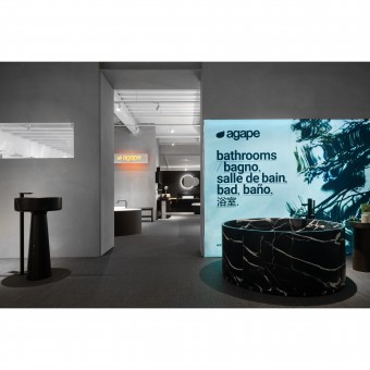
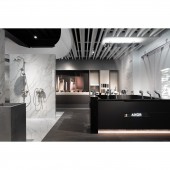
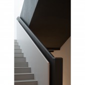
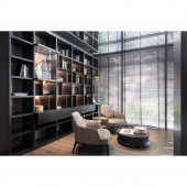
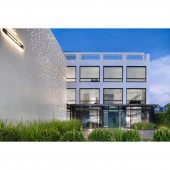
Agape and Poliform Flagship Store Showroom by Hao Chen |
Home > Winners > #114985 |
| CLIENT/STUDIO/BRAND DETAILS | |
 |
NAME: BMH Interior Design PROFILE: Founded in 2014, BMH is an international interior and landscape design firm based in Taiwan, specializing in luxury residential and high-end commercial projects. It includes the iconic department store in Taiwan, the representative residence in the central business district of city and Michelin-Starred restaurant. Over the years, we have experienced various types of cases, won multiple awards from different countries, and we are consistently pursuing improvement. |
| AWARD DETAILS | |
 |
Agape and Poliform Flagship Store Showroom by Hao Chen is Winner in Interior Space and Exhibition Design Category, 2020 - 2021.· Press Members: Login or Register to request an exclusive interview with Hao Chen. · Click here to register inorder to view the profile and other works by Hao Chen. |
| SOCIAL |
| + Add to Likes / Favorites | Send to My Email | Comment | Testimonials | View Press-Release | Press Kit |

