Essence of Void Residential Project by Studio One |
Home > Winners > #114489 |
 |
|
||||
| DESIGN DETAILS | |||||
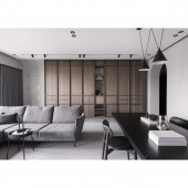
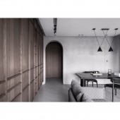
| DESIGN NAME: Essence of Void PRIMARY FUNCTION: Residential Project INSPIRATION: The design inspiration was derived from the concept of Taoism, which emphasizes on reducing artificial interfering and worship the relationship or dialogue between objects and nature. The simplicity with forms and colors, which could arouse people's perception or sensation towards object itself, and discovering the true aesthetic value and essence of being. UNIQUE PROPERTIES / PROJECT DESCRIPTION: This project was tailored by introducing sophisticated forms and monochrome scheme with textured materials, in order to correspond to the concept of void-essence in simplicity. Designer aims to use minimized design volumes yet in a sophisticated form to define the space without losing its function, while applying textured materials that reflects its characteristic expressions that varies with sunlight and with time passes. The aesthetic of being is what designer aims to convey for this project. OPERATION / FLOW / INTERACTION: An interior project with limited space, our design goal is to maximize the possibilities and flexibilities towards the space. With the concept of essence in simplicity, designer minimized design volumes and applied the black island and stone-like cabinet to define each zone and traffic flow in an open plan. In order to create a serenity environment for the owner to get away from their urban busy life, designer introduced natural materials such as mineral paint, wood and concrete flooring to provide them a new perception way towards life and its existing aesthetic. PROJECT DURATION AND LOCATION: The project started in May 2020 and finished in September 2020 in Taipei City, Taiwan. FITS BEST INTO CATEGORY: Interior Space and Exhibition Design |
PRODUCTION / REALIZATION TECHNOLOGY: In order to achieve the openness and cohesiveness within the space, designer removed unnecessary architectural wall and applied gray mineral paint onto walls and concrete epoxy for flooring. Designer also introduced the arch form for hallway and curve line for recessed ceiling to reduce rigid feeling. The black wood island with metal structure was installed along with the stone-liked cabinet to maintain its stability while the cabinet providing storage function. As for the cabinet with pleating and line details, it varies its expression and characteristic with sunlight due to its rustic and textured veneer façade. SPECIFICATIONS / TECHNICAL PROPERTIES: The area of this project is 75.9 sq. m2, which contains foyer, living room,dinning room, two bedrooms, two bathrooms and kitchen. TAGS: Interior Design, Interiors, Residential, Contemporary Space RESEARCH ABSTRACT: How to maximize the space- In order to maximize the space with more possibilities and flexibilities, designer needs to rearrange the architectural walls at its best. Prior to do that, designer needs to decide the area for each zone based on analyzing owner’s life habit. How the materials were selected- Materials were selected based on its natural traits and texture. For the mineral paint and concrete epoxy flooring, designer keeps its rustic feeling but also sand it down a bit to have more comfortable tactile sensation. CHALLENGE: The challenge was to maximizing the small interior space with more possibilities and flexibilities. How the space or zones were defined without setting up a clear or solid boundaries is the key design objective towards this project. Also, under the monochrome color scheme, how to create warmth and visual texture in the place. ADDED DATE: 2020-12-15 02:50:32 TEAM MEMBERS (1) : IMAGE CREDITS: Photographer:MD Pursuit PATENTS/COPYRIGHTS: STUDIO ONE ALL RIGHTS RESERVED. |
||||
| Visit the following page to learn more: https://www.studiooneinterior.com/ | |||||
| AWARD DETAILS | |
 |
Essence of Void Residential Project by Studio One is Winner in Interior Space and Exhibition Design Category, 2020 - 2021.· Read the interview with designer Studio One for design Essence of Void here.· Press Members: Login or Register to request an exclusive interview with Studio One. · Click here to register inorder to view the profile and other works by Studio One. |
| SOCIAL |
| + Add to Likes / Favorites | Send to My Email | Comment | Testimonials | View Press-Release | Press Kit |
Did you like Studio One's Interior Design?
You will most likely enjoy other award winning interior design as well.
Click here to view more Award Winning Interior Design.


