TMU Rebranding Rebranding and Visual Identity by Qian Meng |
Home > Winners > #113464 |
 |
|
||||
| DESIGN DETAILS | |||||
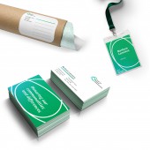
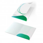
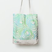
| DESIGN NAME: TMU Rebranding PRIMARY FUNCTION: Rebranding and Visual Identity INSPIRATION: This dynamic, abstract gradient line concept is based on the idea of drawing connections between different grantees, disciplines, countries, and ideas. It captures the TMU value of being a frame to facilitate international collaborations and meaningful grantee relationships. The gradient color treatment of the line shows that when you connect two things, something entirely new is created as a result of that collaboration and work that wouldn’t have existed otherwise. The new colors formed in the middle of the gradient line represent the important work that comes out of the relationships sparked by TMU. This line is active, which denotes constant progress and flexibility, and can be animated to highlight different parts of the brand. It can stretch out to form a frame around various brand elements, helps connect ideas or text together across applications, and is the foundation of the topographical pattern. UNIQUE PROPERTIES / PROJECT DESCRIPTION: Trust for Mutual Understanding (TMU) is a Rockefeller foundation that gives grants to arts and environmentalist nonprofits in East-Central Europe and the United States. This project is to redesign their brand identity, which includes deliverables such as a logo, website, letterheads, envelopes, various merchandise, social media strategy, and branding guidelines. OPERATION / FLOW / INTERACTION: The Brand Identity is articulated in an Identity Guide, a reference document that contains guidelines that users need to create materials (digital and print) that support and represent the brand consistently in visual form. The Identity Guide is a primarily visual document for external purposes. An Identity Guide outlines the visual elements that contribute to the brand strategy, and how these elements should be applied and implemented to contribute to a consistent brand identity and message. The Identity Guide explains how to maintain consistency and recognizability in how these visual elements are applied. PROJECT DURATION AND LOCATION: The project started in January 2018 and finished in April 2019 in the United States. FITS BEST INTO CATEGORY: Graphics, Illustration and Visual Communication Design |
PRODUCTION / REALIZATION TECHNOLOGY: We articulated the Design Principles in a workshop together with the client where we articulated together the key values, core beliefs and underlying philosophy that guides the work. It was immediately evident from the team workshop that the previous visual identity is not universally liked nor is it seen as entirely effective in fully capturing and communicating the story. The aim of the visual identity is not to be liked by everyone but rather to be perceived as effective. While individuals had varying aesthetic tastes and opinions, the team identified some generally universal limitations with the form, fonts, color, feeling, meaning, and application of the current visual identity. SPECIFICATIONS / TECHNICAL PROPERTIES: The graphic design was done with Adobe creative suite; Hannah Meng also did some prototypes for physical deliverables during the process. TAGS: Logo, Branding, Pattern, Visual Identity, Website Design, Design Research RESEARCH ABSTRACT: In addition to individual interviews with over 60 primary stakeholders (staff, board, advisors, grantees, and peer funders), the process included a number of interactive sessions and workshops with the TMU staff, board, and advisors to engage us in generating and critiquing ideas, mapping our key stakeholders, coming to consensus around key strategic questions, and developing a collective voice and common language around the name, mission and purpose, the geography, and the thematic focus areas. CHALLENGE: Together we worked together over the course of nearly two years to assess the current brand; listen to and capture the voices and insights of the key stakeholders; create a rich array of ideas for the visual identity; evolve a final visual identity system across all of our print and digital media, and challenge us to come to a common language and voice around key strategic questions related to both the visual and narrative aspects of the brand story. ADDED DATE: 2020-10-31 01:22:29 TEAM MEMBERS (1) : IMAGE CREDITS: Hannah (Qian) Meng, 2019 |
||||
| Visit the following page to learn more: https://hannah-meng.com/ | |||||
| CLIENT/STUDIO/BRAND DETAILS | |
 |
NAME: Trust for Mutual Understanding PROFILE: http://www.tmuny.org |
| AWARD DETAILS | |
 |
Tmu Rebranding Rebranding and Visual Identity by Qian Meng is Winner in Graphics, Illustration and Visual Communication Design Category, 2020 - 2021.· Press Members: Login or Register to request an exclusive interview with Qian Meng. · Click here to register inorder to view the profile and other works by Qian Meng. |
| SOCIAL |
| + Add to Likes / Favorites | Send to My Email | Comment | Testimonials | View Press-Release | Press Kit |


