DESIGN NAME:
Low Classic
PRIMARY FUNCTION:
Brand Identity and Typography
INSPIRATION:
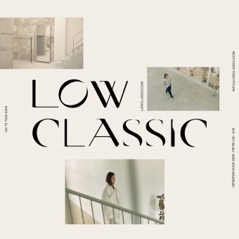
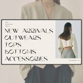
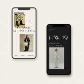
The brand identity is inspired by the 80s fashion magazine, the color is muted and the layout breaks the grid. As well as the typography is combined with elegant curves. This brand campaign is focusing on digital online platforms. eg. social media, e-mails, and web banners. So that the posters are very neat and bold to catch the user eye to stop by the online shop
UNIQUE PROPERTIES / PROJECT DESCRIPTION:
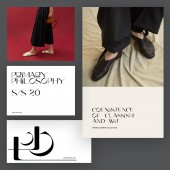
Low Classic is establishing its voice as a new designer label by utilizing chic fabrics, classic silhouettes, and innovative details. This project aims to use untypical typography and a bit of quirky aesthetic choice in representing the looking and feel of this brand. The branding materials including both physical and digital products that give a one of a kind holistic view of Low Classic. The way of showing the brand value is providing classic fashionable textures but with creative details.
OPERATION / FLOW / INTERACTION:
The brand is inspired by 80s fashion, by combining the vintage look with refined digital experience, Low Classic is aiming to bring a retro style and redesign it. The brand color choice is always used mute color in the 80s, and the typography is inspired by the fashion magazine font from the 80s. Low Classic has digitized a vintage look to the e-commerce world.
PROJECT DURATION AND LOCATION:
The project started at the end of 2019 in New York and finished in mid-2020 in New York.
FITS BEST INTO CATEGORY:
Graphics, Illustration and Visual Communication Design
|
PRODUCTION / REALIZATION TECHNOLOGY:
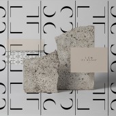
As all the material of the clothing is 100% organic, the brand collaterals are printed by the recycled paper. The way of Low Classic printing all the collaterals are using recycled paper, there's no environment pollution dye color added.
SPECIFICATIONS / TECHNICAL PROPERTIES:
1920px*1280px
TAGS:
Identity, digital design, fashion, typography
RESEARCH ABSTRACT:
The rebranding is focused on the detail of the typography, which will be the critical visual language of this brand. As Low Classic is an independent fashion brand, we are trying to escalate the brand value, as the materials are organic, the aesthetic way of representing the brand is using the mute color palette and printing with organic materials.
CHALLENGE:
There're so many similar minimalists boutique brands on the market, by figuring out using the relatively exaggerated typography and bold layout on the branding campaign.
ADDED DATE:
2020-10-26 16:12:32
TEAM MEMBERS (2) :
Creative Director: Yaman Hu and Designer: Yaman Hu
IMAGE CREDITS:
Yaman Hu, 2020.
|
