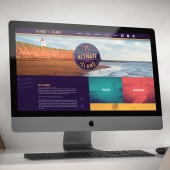
Activate Our Island Advertising Campaign by Dawn Binns |
Home > Winners > #112412 |
 |
|
||||
| DESIGN DETAILS | |||||
| DESIGN NAME: Activate Our Island PRIMARY FUNCTION: Advertising Campaign INSPIRATION: The primary logo takes it's inspiration from vintage camp badges, calling to mind a sense of adventure, designed to inspire people to get out. The colour palette is designed to be summery and high energy by using bright warm colours contrasted with darker cool colours. Prince Edward Island is known for it's lighthouses and while locals can sometimes see their use in promotional materials as a trope the lighthouse symbology here is elevated. UNIQUE PROPERTIES / PROJECT DESCRIPTION: When Covid-19 shut down Prince Edward Island's thriving tourism industry Tourism PEI knew something needed to be done to keep the province's many tourism operators in business. Insight was tasked with creating a campaign to inspire the local population to get out and enjoy everything the Island has to offer. OPERATION / FLOW / INTERACTION: - PROJECT DURATION AND LOCATION: The campaign began to work in June 2020 and was launched in August 2020. The project was carried out in Charlottetown, Canada. |
PRODUCTION / REALIZATION TECHNOLOGY: - SPECIFICATIONS / TECHNICAL PROPERTIES: - TAGS: tourism, government, pei, campaign RESEARCH ABSTRACT: - CHALLENGE: - ADDED DATE: 2020-09-30 14:37:55 TEAM MEMBERS (1) : IMAGE CREDITS: Dawn Binns, 2020. |
||||
| Visit the following page to learn more: https://insightstudiopei.com/tourism-pei |
|||||
| AWARD DETAILS | |
 |
Activate Our Island Advertising Campaign by Dawn Binns is Winner in Advertising, Marketing and Communication Design Category, 2020 - 2021.· Read the interview with designer Dawn Binns for design Activate Our Island here.· Press Members: Login or Register to request an exclusive interview with Dawn Binns. · Click here to register inorder to view the profile and other works by Dawn Binns. |
| SOCIAL |
| + Add to Likes / Favorites | Send to My Email | Comment | Testimonials | View Press-Release | Press Kit |
Did you like Dawn Binns' Advertising Design?
You will most likely enjoy other award winning advertising design as well.
Click here to view more Award Winning Advertising Design.


