Theo Rebrand Branding by Clarkmcdowall Inc |
Home > Winners > #112066 |
 |
|
||||
| DESIGN DETAILS | |||||
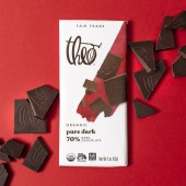
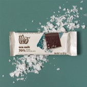
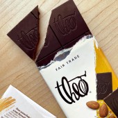
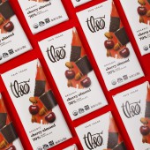
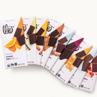
| DESIGN NAME: Theo Rebrand PRIMARY FUNCTION: Branding INSPIRATION: Our design was inspired by Boldly Reimagined - bringing consumers closer to the layered beauty of responsibly sourced chocolate. We used the bold paint stroke as a window to taste discovery and an expression of the craft of premium chocolate. The white background suggests clean eating, purity of ingredients and allows the pack to cut through visual clutter on shelf. The paint stroke is a distinct element that stands out within the category. The Theo brand mark itself of idiosyncratic quality. UNIQUE PROPERTIES / PROJECT DESCRIPTION: Theo Chocolate pioneered fair-trade, bean-to-bar chocolate. But when new players came along and fair trade was table stakes, it was time to differentiate. Consumers wanted their choice in chocolate to be simple. We needed to show the link between higher-standard chocolate and good taste. We clarified brand purpose, expanding their offerings through innovation. For design, we prioritized elements that were central to this story and developed a confident visual identity across the ecosystem OPERATION / FLOW / INTERACTION: Based on Designalytics’ consumer evaluation and sales performance, it’s clear that shoppers are sweet on the new design. Over the past 6 months, Theo Chocolate’s sales have increased by 11% in the grocery channel compared to the same period during the prior year. The brand has outpaced and contributed to category growth during COVID-19. Moreover, base velocities over the past six months have increased by more than 20% in both grocery and natural channels compared to the same period in 2019. Based on Designalytics’ consumer evaluation and sales performance, it’s clear that shoppers are sweet on the new design. Over the past six months, Theo Chocolate’s sales have increased by 11% in the grocery channel compared to the same period during the prior year. The brand has outpaced and contributed to category growth during the COVID-19 crisis. Moreover, base velocities over the past six months have increased by more than 20% in both grocery and natural channels compared to the same period in 2019. PROJECT DURATION AND LOCATION: 6 months from kickoff to delivery of final packaging. FITS BEST INTO CATEGORY: Packaging Design |
PRODUCTION / REALIZATION TECHNOLOGY: The project started with a segmentation study to understand the premium chocolate category and consumer, including current and future Theo consumers. Following segmentation, we did a brand equities study to understand what elements were central, supporting and not relevant to Theo's study. From there, we defined a differentiated brand purpose and positioning platform which ultimately inspired the creative idea, Boldly Reimagined. SPECIFICATIONS / TECHNICAL PROPERTIES: Bars are approximately 3 x 6 inches - paper overwrap with foil inner / cups are approximately 2x4 inches flow-rap on matte substrate TAGS: branding, rebrand, packaging redesign, fairtrade chocolate, brand transformation, future-ready branding, brand purpose RESEARCH ABSTRACT: Research included an online consumer segmentation to understand the premium chocolate category and consumer, including current and future Theo consumers. For qualitative research, we did both ethnographies and brand equities research online to evaluate the role and meaning of key brand equities. The results included consumer segments, a bullseye consumer target profile, a core consumer insight, and a tangible brief with recommendations for brand evolution. CHALLENGE: Growth had slowed and there was pressure to turn the brand back to positive growth quickly.Before reimagining Theo visually and verbally, we had to understand the premium chocolate consumer, the category and where they fit within it. We wanted to ensure we understood the role of the current brand equities before moving forward. Theo also had great attributes to communicate and part of the challenge was to prioritize the messages that were most meaningful to consumers. ADDED DATE: 2020-09-29 20:06:07 TEAM MEMBERS (3) : Creative Director: Adrienne Muken , Designer: Audra Schroeder and Business Director: Betsy Price IMAGE CREDITS: David Estep |
||||
| Visit the following page to learn more: https://theochocolate.com/?utm_source=go |
|||||
| CLIENT/STUDIO/BRAND DETAILS | |
 |
NAME: Clarkmcdowall PROFILE: - |
| AWARD DETAILS | |
 |
Theo Rebrand Branding by Clarkmcdowall Inc is Winner in Packaging Design Category, 2020 - 2021.· Press Members: Login or Register to request an exclusive interview with Clarkmcdowall Inc. · Click here to register inorder to view the profile and other works by Clarkmcdowall Inc. |
| SOCIAL |
| + Add to Likes / Favorites | Send to My Email | Comment | Testimonials | View Press-Release | Press Kit |

