Tanaka 1789 X Chartier Sake Blend 001 Branding and Design by Laurent Hainaut |
Home > Winners > #112010 |
 |
|
||||
| DESIGN DETAILS | |||||
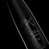
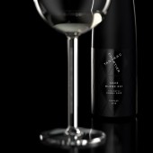
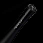
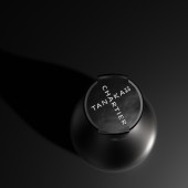
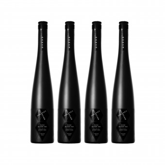
| DESIGN NAME: Tanaka 1789 X Chartier Sake Blend 001 PRIMARY FUNCTION: Branding and Design INSPIRATION: Inspired by the distinctive architecture of the Tanaka Brewery, the black on black grid pattern in the background of the label invokes the beautiful brewery walls, an embodiment of the unique characteristics of the Edo period’s Kura architecture. Printed as varnishes around the bottle, the grid pattern is sequenced to create a series of hexagons, a key symbol of Chartier’s aromatic science and expertise. UNIQUE PROPERTIES / PROJECT DESCRIPTION: forceMAJEURE worked closely with Chartier to craft a unique design for this innovative series of blends. Inspired by the distinctive architecture of the Tanaka Brewery, the black on black grid pattern in the background of the label invokes the beautiful brewery walls, an embodiment of the unique characteristics of the Edo period’s Kura architecture. Printed as varnishes around the bottle, the grid pattern is sequenced to create a series of hexagons, a key symbol of Chartier’s aromatic science. From the tile grid pattern and hexagon, we saw that both Tanaka 1789 and Chartier featured black and white prominently in their own branding. The minimalism, elegance and luxury of black and white match the quality of the product: in traditional sake packaging, black bottles are reserved for the most premium Sakes. To illustrate the “best of” in the brand’s identity, we combined Tanaka and Chartier together in a cross pattern to create a strong logo lockup—using a common A to bring the two words together. OPERATION / FLOW / INTERACTION: - PROJECT DURATION AND LOCATION: - FITS BEST INTO CATEGORY: Packaging Design |
PRODUCTION / REALIZATION TECHNOLOGY: forceMAJEURE knew from the brief that the design needed to be modern, simple and sophisticated. The detail needed to be expressed to show two rich cultures merging into one. The designers were all inspired by the pattern of the traditional brewery’s wall, and the hexagon that is a part of Francois Chartier’s brand. The design selected for the label was a beautiful blending of the two, and we extensively researched the paper stock to use for the label that would be the perfect grain and texture to seamlessly match the color and texture of the bottle. In order to work with a more limited production run, we needed to find the right suppliers to coordinate with the bottlers and other suppliers to bring all of the elements needed for the production together on time. SPECIFICATIONS / TECHNICAL PROPERTIES: - TAGS: - RESEARCH ABSTRACT: - CHALLENGE: - ADDED DATE: 2020-09-29 17:29:15 TEAM MEMBERS (4) : Michelle Mak, Creative Director, Kei Hayashi, Senior Designer, Linda Tseng, Production Director and IMAGE CREDITS: Laurent Hainaut, 2020. |
||||
| Visit the following page to learn more: http://www.forcemajeure.design | |||||
| AWARD DETAILS | |
 |
Tanaka 1789 X Chartier Sake Blend 001 Branding and Design by Laurent Hainaut is Winner in Packaging Design Category, 2020 - 2021.· Press Members: Login or Register to request an exclusive interview with Laurent Hainaut. · Click here to register inorder to view the profile and other works by Laurent Hainaut. |
| SOCIAL |
| + Add to Likes / Favorites | Send to My Email | Comment | Testimonials | View Press-Release | Press Kit |

