DESIGN NAME:
Reunion
PRIMARY FUNCTION:
Residential Apartment
INSPIRATION:
In the modern society that values social gathering events and reunions, in this case, the designer in pursuit the idea of people oriented, focusing on interaction, gathering and integration between people. Abandoning luxury and exquisite carving, through the casually sitting on the ground and relaxed as nature. The open layout is adopted that respects privacy by optional partitions in order to make the house a multifunctional zone optimal for entertaining and gathering events at home.
UNIQUE PROPERTIES / PROJECT DESCRIPTION:
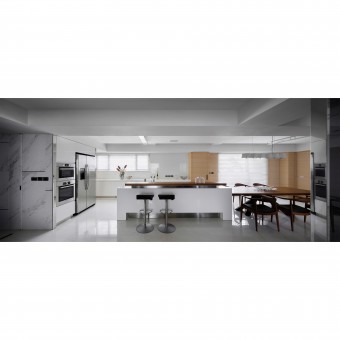
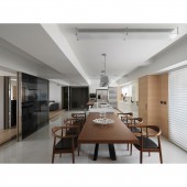
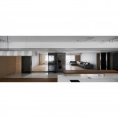
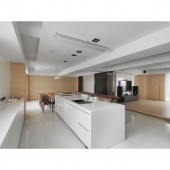
The space is mainly designed with dual-axis migration, and an independent and open pattern can be used to make everything into a whole. The designer pinpoints the dining kitchen and makes the kitchen island combined with the table the core for entertaining and interacting. At the same time, it has a perfect living function, interactive and social dynamic and static dual axis, giving the whole house both flexible and transparent, comfortable and stress-free.
OPERATION / FLOW / INTERACTION:
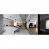
The social dining kitchen is pinpointed specifically in this case, using open penetrating spaces to increase the time between people and shorten the distance. In order to render a breezy atmosphere and keep the layout as open as possible. The space uses the floor-raising technique, so that everyone can sit on the floor when there are a large number of people, even if they are in different venues such as audio-visual rooms and multi-function rooms, relatives and guests interact with each other without delay.
PROJECT DURATION AND LOCATION:
The project started in Feb 2020 and finished in April 2020 in Taiwan.
FITS BEST INTO CATEGORY:
Interior Space and Exhibition Design
|
PRODUCTION / REALIZATION TECHNOLOGY:
This space focuses on dining, entertainment, and sports, and uses gatherings to get acquainted with the emotions between people. In the layout part, the designer removes unneeded partitions for one open public zone and defines the space as the dining kitchen, the audio-visual room and the multifunctional yoga room. The layered ceiling removes discomfort brought by crossbeams and renders a tidy look and the compartments with functionalities like storage, warehouse, bathroom and cooking kitchen hidden behind the wall make incomplete zones with irregularities well organized.
SPECIFICATIONS / TECHNICAL PROPERTIES:
For a refreshing unchained feel, the designer attempts to remove partitions and material lines by hiding the doors of cabinets and bathroom for a tidy, calm look by the Less is More design idea, the tone values huge blanks in white to enhance bright sunlight in combination with the natural materials of timber and stone for a cozy warm finish of the house and the dark glass sliding door in black able to be left open or close depending on daily routines serves as a subtle partition.
TAGS:
Interior, Design, House, Residence
RESEARCH ABSTRACT:
In the digital era, designers hope that users in this space can put down their phones, tablets and 3C products and return to the most primitive interaction between people. Through the subtractive design, the designer removed partition to make the house one comfy refreshing flexible partition-free zone, the layered ceiling removes discomfort brought by the main crossbeam, and incomplete spaces serve as compartments with functionalities like warehouse and bathroom.
CHALLENGE:
The obstacles of indoor beams will not only affect the feng shui and aura of people and houses, but also affect people’s career fortunes and physical health for Asians’ social perspectives. Therefore, it is a challenge to create a high-low ceiling model to resolve the visual barriers of too low beams. And make use of the large windows and open spaces in the room to introduce a lot of light and smooth air to make people feel comfortable and comfortable.
ADDED DATE:
2020-09-29 07:30:55
TEAM MEMBERS (1) :
IMAGE CREDITS:
Cheng Hou Lin, 2020.
|
