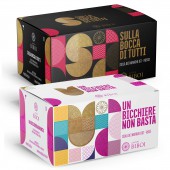
Biboi Wine Labels by Giovanni Murgia |
Home > Winners > #111397 |
 |
|
||||
| DESIGN DETAILS | |||||
| DESIGN NAME: Biboi PRIMARY FUNCTION: Wine Labels INSPIRATION: The colors of wine and the typical traditional clothes of Sardinia. The geometric shapes and textures that recall the typical elements that identify these wines. The research started with the typical iconography of the 70s and the colorful and contrasting graphic style of these graphics. The goal is to identify these products in a fresh and decisive way to address a young wine lovers target. UNIQUE PROPERTIES / PROJECT DESCRIPTION: The concept of these labels is inspired by the design of the 70s. A mix of shapes and bright colors that highlights the geometric shapes and textures that identify the characteristic elements of these wines and the territory: the mountains, the sea and the typical Sardinian vegetation. OPERATION / FLOW / INTERACTION: The design of these labels is studied to give a tactile effect when the bottle is taken, thanks to the label paper and tactile processing. The goal is to communicate a fresh and youthful, light-hearted and immediate design suitable for a young audience looking for a quality wine with an intriguing appeal. PROJECT DURATION AND LOCATION: The project is started in January 2020 and complete in April 2020 in Sassari (Sardinia, Italy). It is presented on media in April 2020 in Sorgono (Sardinia, Italy) FITS BEST INTO CATEGORY: Packaging Design |
PRODUCTION / REALIZATION TECHNOLOGY: The label was printed on special paper with a tactile feel. This characteristic gives the label a more prestigious and important role. To make the label more precious, metal sheets in gold and pink were used as well as a Braille relief on the name of the wine and on the iconographic elements. SPECIFICATIONS / TECHNICAL PROPERTIES: The peculiarity of the label consists in the fact that it is a single piece that almost completely wraps the bottle. The total dimensions are 222x82 mm TAGS: wine, packaging, graphic design, label design, sardinia RESEARCH ABSTRACT: The research for this design started from the study of the graphic style typical of the 70s. Together with this, iconographic elements were inserted that represent some of the elements that characterize the territory from which these wines are born. Each label is also characterized by the representation of the initial letter of its name, obtained from the union of the geometric elements that define the design. Even the choice of naming is deliberately ironic and youthful. CHALLENGE: The creative challenge to create these labels was to create an unconventional design for wines from a traditional territory such as that of Sardinia. At the same time we wanted to give a light-hearted but elegant appeal to meet the expectations of a young and disengaged public. ADDED DATE: 2020-09-27 15:57:57 TEAM MEMBERS (4) : Art direction: Giovanni Murgia, Designer: Giovanni Murgia, 3D render and mockup: Giovanni Murgia and Print: Juliagraf SpA IMAGE CREDITS: Giovanni Murgia, 2020. |
||||
| Visit the following page to learn more: https://rb.gy/3keh9t | |||||
| AWARD DETAILS | |
 |
Biboi Wine Labels by Giovanni Murgia is Winner in Packaging Design Category, 2020 - 2021.· Read the interview with designer Giovanni Murgia for design Biboi here.· Press Members: Login or Register to request an exclusive interview with Giovanni Murgia. · Click here to register inorder to view the profile and other works by Giovanni Murgia. |
| SOCIAL |
| + Add to Likes / Favorites | Send to My Email | Comment | Testimonials | View Press-Release | Press Kit | Translations |
Did you like Giovanni Murgia's Packaging Design?
You will most likely enjoy other award winning packaging design as well.
Click here to view more Award Winning Packaging Design.


