DESIGN NAME:
Light Chasing
PRIMARY FUNCTION:
Commercial Space
INSPIRATION:
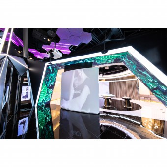
The original inspiration is the modern sense of technology, so the designers adopt the combination of lines and light to present the main idea through the whole space. The designers adopt a huge ring light on the ceiling in the middle of the square to echo the concept of the spotlight, so the experiencers can take pictures as much as possible in the space at the same time. Also, they can reserve the most beautiful skin conditions in this space.
UNIQUE PROPERTIES / PROJECT DESCRIPTION:
The biggest feature is the use of lots of designs on the lighting in this project. In addition, this space is mainly used for product introduction and skin testing. Therefore, symbolic meanings that echo the packaging can be seen everywhere such as the welcoming wall that highlights the brand's diamond concept and the hexagonal honeycomb structure light curtain. Thus, they symbolize molecules and atoms.
OPERATION / FLOW / INTERACTION:
As a light-based interior design, the designers need to take into account the color and intensity of the light. The yellow light has texture, but it will appear sallow when irradiated on the skin. White light can make up for its shortcomings, but it will be too cold visually. Thus, lots of work has been done when choosing the two colors. Through 3D rendering, space presents zero blind spots of light. In the space, the designers present the image of light and water of clients products with the deployment of light.
PROJECT DURATION AND LOCATION:
The project finished in July 2020 in Xinyi District, Taipei City.
FITS BEST INTO CATEGORY:
Interior Space and Exhibition Design
|
PRODUCTION / REALIZATION TECHNOLOGY:
In order to echo the outer packaging of skin care products and the brand concept, the designers use piano lacquer and matte paint to emphasize the texture that seems like black pearls. Derived from the idea of science and technology, the designers apply titanium plate and wool-silk texture to create metal lines that are used to connect the space. Thus, the whole space can form different refraction with light. When conceiving the product, the use of terrazzo creates a fashionable and clean sense of transparency. Moreover, the symbolic meaning of the fountain coincides with the important elements of the product, water.
SPECIFICATIONS / TECHNICAL PROPERTIES:
The floor area is 247.935 square meters. Space is planned for product introduction and banquets, so the ceiling is equipped with functional audio, which can have a good radio effect in the circular space capsule. Also, the detachable projector is convenient for the clients to change the products according to the seasons. With the different products, shadow projections are different. In the tube glass of the laboratory, the bottom of the tube glass is refracted by a mirror to give the experiencers the illusion of floating in the air, presenting the light feeling. It is also one of the characteristics of the clients product, lightness.
TAGS:
Light, diamond, technology, light and shadow, line
RESEARCH ABSTRACT:
The light has different landscapes and images in the day, at night, at low, at high, far, and close. There are straight lines of light on the welcoming wall, emphasizing diamonds, and fashion. The circular lines of light on the product square. , highlighting the product concept, and restoring the most beautiful appearance of the skin conditions. The vertical light can be seen in the tube glass of the laboratory, so the experiencers have the feeling of lightness. The use of light presents the original shape of the texture. With moderate light, it integrates every part of the space, so the place has a superb vision.
CHALLENGE:
Located in a downtown area, the construction process takes place in different areas. The finished goods need to be transported to the site and assembled. Thus, the designers sophisticatedly take into account the planning and communication with clients. The low-dust construction site reduces the damage of environmental pollution. In the early stage, the image of light was too abstract when communicating with the clients, so the design team spares no efforts to collect and modify the designs. The perfect use of light and the echo of the brand concept present in the final result.
ADDED DATE:
2020-09-25 09:15:52
TEAM MEMBERS (1) :
Yue-Han Li
IMAGE CREDITS:
MUYAN Design
|


