Muse Smartwatch Face by Alex Pan Yong |
Home > Winners > #110651 |
 |
|
||||
| DESIGN DETAILS | |||||
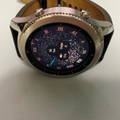
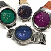
| DESIGN NAME: Muse PRIMARY FUNCTION: Smartwatch Face INSPIRATION: The inspiration came from a casual sketch that I was aimlessly drawing on my iPad when I sit in a bar. As the strokes went on, the sketch became a kind of totem. Then, the idea came out. Let this totem-like graphic tells the time, combining the feeling of nature. Let it be the main element of my smartwatch face. Make it looks like a kind of gemstone. UNIQUE PROPERTIES / PROJECT DESCRIPTION: The Muse is a smartwatch face that tells the time while doesn't look like any traditional watch face as we usually thought. It looks more towards the combination of stone and gem. The feeling it conveys is more close to the nature while still keeps the beauty of gem. OPERATION / FLOW / INTERACTION: The design is already released on Facer app. Go to Facer app or website (facer.io), search "Artalex", and look for the name "Muse". Click the "send to watch" button to sync the design into your smartwatch. You need the Facer app installed on your smartwatch. PROJECT DURATION AND LOCATION: The project started in February 2020 in Singapore and finished in September 2020, and is released on Face app and WatchMaker app in September 2020. FITS BEST INTO CATEGORY: Interface, Interaction and User Experience Design |
PRODUCTION / REALIZATION TECHNOLOGY: I aimlessly drew a sketch on my iPad. The sketch turned out to be the main element of the design. The app I used on iPad is Procreate. Once finished the drawing, exported into Photoshop, separate different layers for different hours. Then, export these layers (12 layers) into png images. After that, import these 12 layers into Facer (watch face making app), use programming to control which layer should be highlighted in which hour. For example, layer 1 will be highlighted when 1 am/pm. So, that's how to tell the hour. For the minute, I use a glare-like stroke to represent the glare from the light (the beauty of nature). At the centre of the watch face, I put those essential information such as date, step count, battery level, so that the user can still grab the information really quickly. For the numbers around the watch face, I use roman numerals to give the sense of antique, as well as add on different colours to make the overall looking more like ancient gemstone. SPECIFICATIONS / TECHNICAL PROPERTIES: The dimension of this design is 400 x 400px on Android watch, 360 x 360px on Samsung watch. It supports both round and square smartwatches. TAGS: gem, nature, stone, ancient, gemstone, nostalgia, luxury, informative RESEARCH ABSTRACT: Nothing much about the research. The idea just came out suddenly from my aimless sketch. At that moment, I had the feeling of making it a non-traditional watch face. Just follow the heart. CHALLENGE: The hardest part of this design is to make the overall looking "less-look-like ADDED DATE: 2020-09-22 16:44:25 TEAM MEMBERS (1) : IMAGE CREDITS: Image #1: Photographer Pan Yong, Main image, 2020. Image #2: Photographer Pan Yong, Single shot, 2020. Image #3: Photographer Pan Yong, Single shot, 2020. Image #4: Photographer Pan Yong, Single shot, 2020. Image #5: Photographer Pan Yong, Group shot, 2020. PATENTS/COPYRIGHTS: Copyrights belong to Alex Pan Yong, 2020 |
||||
| Visit the following page to learn more: http://www.facer.io/u/artalex | |||||
| AWARD DETAILS | |
 |
Muse Smartwatch Face by Alex Pan Yong is Winner in Interface, Interaction and User Experience Design Category, 2020 - 2021.· Read the interview with designer Alex Pan Yong for design Muse here.· Press Members: Login or Register to request an exclusive interview with Alex Pan Yong. · Click here to register inorder to view the profile and other works by Alex Pan Yong. |
| SOCIAL |
| + Add to Likes / Favorites | Send to My Email | Comment | Testimonials | View Press-Release | Press Kit | Translations |
| COMMENTS | ||||||||||||
|
||||||||||||
Did you like Alex Pan Yong's Interface Design?
You will most likely enjoy other award winning interface design as well.
Click here to view more Award Winning Interface Design.


