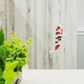
Hiroshima Terrace Corporate Identity by Shinji Arashigawa |
Home > Winners > #110625 |
 |
|
||||
| DESIGN DETAILS | |||||
| DESIGN NAME: Hiroshima Terrace PRIMARY FUNCTION: Corporate Identity INSPIRATION: This poster is expressed only in the shape of a diamond. The ripples of water represent the spread to the world. In addition, the carp is also said to be the "incarnation of the dragon" and represents the regal presence. We expressed the Mitsubishi Corporation "Incarnation of a dragon" expanding "from Hiroshima to the world", and made it a poster as the artwork. UNIQUE PROPERTIES / PROJECT DESCRIPTION: The logo for the in-house space for communication (HIROSHIMA TERRACE) creates a shape similar to the torii gate of Miyajima, so it can emphasize the uniqueness of Hiroshima. And also, the reason why it uses the carp shape is that Hiroshima has long been called the city of water, and that it was also called "the city of carp" because carp lived there. Therefore, we have tried overlapping it with the image of Nishikigoi wearing the Mitsubishi colors to express both Hiroshima and Mitsubishi. OPERATION / FLOW / INTERACTION: This is the sign of each room of the Mitsubishi Corporation Hiroshima branch It is a design of a communication space to unite the feelings of the Mitsubishi Corporation and group companies. It is expressed using the carp that is the identity of Hiroshima. PROJECT DURATION AND LOCATION: The project started in October 2019 and finished in December 2019. The creation of poster variations continues. FITS BEST INTO CATEGORY: Graphics, Illustration and Visual Communication Design |
PRODUCTION / REALIZATION TECHNOLOGY: The poster is offset printed and represented by process colors and gold grid lines. The carp shape of the in-house sign is made of magnets so that it can be placed anywhere you like. The rooms name created an original fonts. This poster is expressed only in the shape of a diamond. SPECIFICATIONS / TECHNICAL PROPERTIES: Poster 728mmx1030mm Sign 200mmx200mm - 900mmx1200mm TAGS: Hiroshima, Terrace, Mitsubishi, Carp, world, DIA RESEARCH ABSTRACT: This is the visual identity, the sign, or the artwork for the office space. It has developed with the keyword "from Hiroshima to the world". The logo for the in-house space for communication (HIROSHIMA TERRACE) uses its initial HT and creates a shape similar to the torii(Shinto shrine archway) gate of Miyajima, so it can emphasize the uniqueness of Hiroshima. CHALLENGE: the reason why it uses the carp shape is that Hiroshima has long been called the city of water and that it was also called "the city of carp" because carp lived there. Therefore, we have tried overlapping it with the image of Nishikigoi (a brocade carp) wearing the Mitsubishi colors "red, black, and white" to express both Hiroshima and Mitsubishi. ADDED DATE: 2020-09-22 11:31:10 TEAM MEMBERS (2) : Graphic Designer:Shinji Arashigawa and Interior Designer:Ryoutarou Kouduma IMAGE CREDITS: Shinji Arashigawa, 2020. |
||||
| Visit the following page to learn more: https://bit.ly/3j6ogil | |||||
| AWARD DETAILS | |
 |
Hiroshima Terrace Corporate Identity by Shinji Arashigawa is Winner in Graphics, Illustration and Visual Communication Design Category, 2020 - 2021.· Press Members: Login or Register to request an exclusive interview with Shinji Arashigawa. · Click here to register inorder to view the profile and other works by Shinji Arashigawa. |
| SOCIAL |
| + Add to Likes / Favorites | Send to My Email | Comment | Testimonials | View Press-Release | Press Kit |


