DESIGN NAME:
Cascahuin
PRIMARY FUNCTION:
Tequila
INSPIRATION:
The inspiration comes from our pre-Hispanic ancestors, their crafts, their materials and the use of the stars for each decision making
UNIQUE PROPERTIES / PROJECT DESCRIPTION:
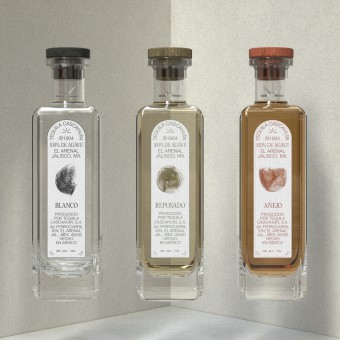
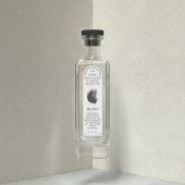
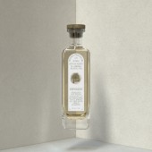
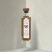
The process of developing the customized package consisted of making modifications to the mouth, ring, and neck of the bottle so that the sealing system works by means of a cork stopper, in addition to placing the icon designed for the brand in high relief on the neck of the bottle, which gives it a subtle strength and characteristic seal of the package.
OPERATION / FLOW / INTERACTION:
-
PROJECT DURATION AND LOCATION:
The project started in April 2020 in Mexico and finished in September 2020 in Mexico
|
PRODUCTION / REALIZATION TECHNOLOGY:
The production process of the glass container will be carried out by blow molding. The standardization of the base material considers its base in sodium-calcium glass.
For the stopper - cork is produced a type Spark, developed to measure, using selected natural cork grains and inked with food grade vegetable pigments.
SPECIFICATIONS / TECHNICAL PROPERTIES:
the dimensions of the packaging are as follows:
70 mm x 70 mm x 260 mm
TAGS:
design, product design, graphic design, art direction, tequila, bottle, visual design
RESEARCH ABSTRACT:
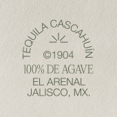
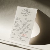
The graphic identity of Tequila Cascahuín was developed from the conceptualization of three elements that affect the agricultural processes of the blue agave: the earth, the stars and time.
To talk about the earth, pastel pigments were used for the development of the graphic variables, reading the accidents and qualities of this material; like the one that decomposes organically achieving pulverization, silences and tonalities of earthy sensations.
The game with the stars invites to conceive the cycles of cultivation as a rhythm that frames the agave landscape in nights and days, crickets and cicadas, rain and sleep.
Determine the auspicious times, of planting, cultivation and harvest.
Time marks the fullness and aging, which is represented by a bowl, a small cup with a concave shape made of clay, guaje or wood; used by our pre-Hispanic ancestors. The symbol of the bowl represents the matrix, the origin. In our ancestral tradition, the jícaras and vessels were used mainly as containers for water and food, they are the guardians of life over time.
CHALLENGE:
One of the obstacles that we presented in the development of the bottle was the manufacture in blown glass, since it was very important to have the details with quality and fineness as well as the cork carved in stone.
ADDED DATE:
2020-09-18 21:58:17
TEAM MEMBERS (2) :
Creative Director: Ana Paula Santana and Product Designer: Irving Jimenez
IMAGE CREDITS:
All photos: Irving Jimenez & Humberto Vanhuten
|
