La Pause Parisienne Visual Identity by Fanny De Bray |
Home > Winners > #109854 |
 |
|
||||
| DESIGN DETAILS | |||||
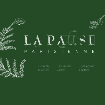
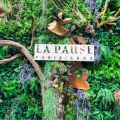
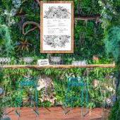
| DESIGN NAME: La Pause Parisienne PRIMARY FUNCTION: Visual Identity INSPIRATION: The logo is inspired both by nature and by the idea of taking a break. The U of the name is directly inspired by the pause symbol. UNIQUE PROPERTIES / PROJECT DESCRIPTION: The letters are designed in the form of tree leaves. The U is a symbol of taking a break as well as an empty space within the letters. It is also used as a symbol that offers meaning and is surrounded by a crown of leaves. To reinforce the presence of nature, the logo is surrounded by greenery and images of plants. OPERATION / FLOW / INTERACTION: It was important that the graphic universe represented the already existing decoration of the barge in order to offer a complete experience of escape for the customer. PROJECT DURATION AND LOCATION: The project started in April 2019 and finished in June 2019. FITS BEST INTO CATEGORY: Graphics, Illustration and Visual Communication Design |
PRODUCTION / REALIZATION TECHNOLOGY: Menu SPECIFICATIONS / TECHNICAL PROPERTIES: Menu: 210 mm x 297 mm TAGS: nature, leaves, pause, restaurant, graphic design RESEARCH ABSTRACT: It was necessary to be inspired by nature and elements present on the lean to achieve this new identity. Renovated in 2019, the former restaurant Le Quai leaves in its place a 460 m2 space for meetings and events and strives to create a breath of fresh air to event coordinators. Redesigned as a green oasis in the heart of Paris, the floating event space creates a nature-like atmosphere during all four seasons and is available during the day as well as at night. CHALLENGE: The change of name of the restaurant and the creation of a graphic universe adapted to an existing floral decoration. ADDED DATE: 2020-09-10 15:27:30 TEAM MEMBERS (2) : Creative Director: Fanny de Bray and Graphic Designer: Anna Cesa IMAGE CREDITS: Illustrator: Anna Cesa PATENTS/COPYRIGHTS: Copyright Made for you |
||||
| Visit the following page to learn more: http://urlz.fr/dMYk | |||||
| AWARD DETAILS | |
 |
La Pause Parisienne Visual Identity by Fanny De Bray is Winner in Graphics, Illustration and Visual Communication Design Category, 2020 - 2021.· Press Members: Login or Register to request an exclusive interview with Fanny De Bray. · Click here to register inorder to view the profile and other works by Fanny De Bray. |
| SOCIAL |
| + Add to Likes / Favorites | Send to My Email | Comment | Testimonials | View Press-Release | Press Kit |


