DESIGN NAME:
Sea to Sky
PRIMARY FUNCTION:
Residential Apartment
INSPIRATION:
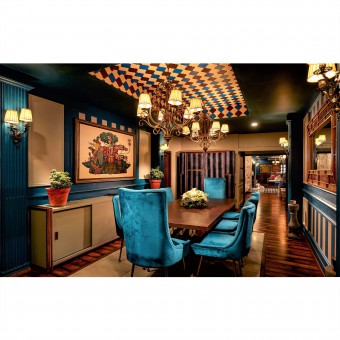
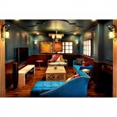
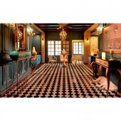
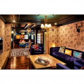
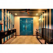
The sky grew darker, painted blue on blue, one stroke at a time, into deeper and deeper shades of night ― Haruki Murakami. This quote was my main idea behind designing this apartment. The idea was to bring in the elements of the nature in focus, such as sea, sky and botanicals. The free-flowing base colour teal being the highlight symbolically denoting dusked sky and deep blue sea with other colours as accents exemplifying various moods of the sky.
UNIQUE PROPERTIES / PROJECT DESCRIPTION:
The client's main requirement was to give them a feel of a living in a palatial bungalow and not a compartmentalised apartment as they wanted the nostalgia of their growing-up years in terms of large open spaces and the feel of Old India interlacing with today’s India. Since they live in a busy city, they wanted to bring outdoors inside. Three generations of people are living in the house- client and his wife in their late 50’s, his mother in her late 70’s and his son and daughter-in-law in their late 20’s. So, the blend of old and new was a very important design aesthetics to be incorporated. Uniqueness of this project is blending the four predominant themes namely Vibe of India, Nature, Palatial feel and European influence under one space and to make an apartment feel like a bungalow. Another uniqueness is the extensive use of elements used whether in decor products or furniture have been aesthetically produced by collaborating with artisans and craftsmen.
OPERATION / FLOW / INTERACTION:
Every element, product and walls were designed in a way as though they are living entities interacting with one another. Each has their own unique characteristics but also having a subtle influence of one another making it all seem like members of a big large family. This interaction of every element with one another is what makes this space come together. The vibrant Indianness binding with the subtle European influence, power punches of combinations of metals and the mystical romanticness of Nature has brought life into this space. The idea was to create a space that looked breathing, swaying with the breeze and dancing in joy.
PROJECT DURATION AND LOCATION:
November 2018 - April 2019, India.
FITS BEST INTO CATEGORY:
Interior Space and Exhibition Design
|
PRODUCTION / REALIZATION TECHNOLOGY:
This project is based in India, and since the time of modernization, a lot of ethnic, cultural traditions are slowly dying. The idea here was to bring back the Indian traditions like the old maharaja style of interior but with a twist of European detailing like beadings used on the walls, windows and doors, false ceiling detailing. Immense amount of emphasis is given to craftmanship of artisans. There are parts of the house which have been painstakingly hand painted by a local artist. All the products made and sourced are custom design and made to order according to the theme. They are all hand carved and not machine made. Care has been taken even on the decor front, where paintings used is a mixed media with acrylic colour base and pen and ink intricate doodle on it depicting the Indian mythology, the mirror used are sourced from Peru, where the Peru artisans use this technique of reverse glass painting. The entire space is a work by a myriad of artisans and craftsmen.
SPECIFICATIONS / TECHNICAL PROPERTIES:
A portion of the house comprising approximately to 1200 sq.ft had been renovated. This portion included all the common areas - Foyer, Hallway, Informal and formal living room, Formal dining room and a casual dining room.
TAGS:
Indian Interiors, tranquility, nature, sea and sky, apartment renovation
RESEARCH ABSTRACT:
Type- Colour combinations, to get the perfect colour of teal depicting my Sea to sky idea and collaborating with various craftsmen, carpenters, artisans and manufacturers for the best output.
Objective- Traditional way of making things like furniture and home decor items and juxtaposing with modern conveniences and technology.
Methodology and tools- Idea was collaborating with group of skilled artists from around the country. Each state is known for a different purpose of handcrafting products. North region of India is famous for carvings on the furniture and hence the furniture made was from that region. Local south region craftsmen were used for intricate mouldings done on the walls, doors and ceilings. Local artist was hired to hand paint patterns on some falls and ceilings. Decor items were procured from a boutique that housed local artisans work from around the world like the example given before of the mirrors.
Effect of the Research in real life phenomenon- Major effect was to change the limited approach of the client’s belief on the extensive use of the dark hued walls. In their opinion like most, they thought it might make a space look smaller whereas in reality, the thoughtful colour combination not only lifted the space but made the space look larger and grander than its area. Also, one of the important factors was uplifting the craftsmen and artisan’s traditional way of creating products rather than using modern technological machine-made products. Since in modern times, the use of artisanal products is reducing, I wanted to bring the value that it deserves even in today’s time and age.
CHALLENGE:
The main challenge was to make such a small space look almost palatial. The other challenge was to break free the spaces from its a compartmentalized structures and give it a free flow and an open feel where interaction from one space to another is almost visible and audible. Also, normally a neutral palette is used for a smaller space for it to seem more bigger, however, I used a deep teal here to lift up the space keeping in mind the natural light and cross ventilation. As a result the space looked even bigger than what it had seem before the renovation which was all white wall house. However, the most challenging aspect of renovating this space was to finish it within a tight deadline keeping in mind the clients living in the same house during the process and also keeping in mind that the work could only be done for a limited number of hours each day as it is fully residing residential apartment.
ADDED DATE:
2020-07-23 13:24:16
TEAM MEMBERS (1) :
IMAGE CREDITS:
Image #1 to Image #5: Photographer Kunal Daswani, Sea to sky Residential apartment renovation, 2019.
|
