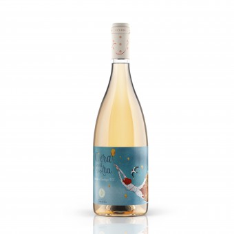
Cera Una Volta Wine Label by Giovanni Murgia |
Home > Winners > #108149 |
 |
|
||||
| DESIGN DETAILS | |||||
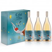
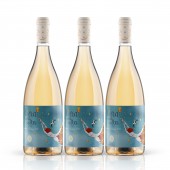
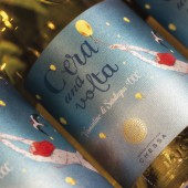
| DESIGN NAME: Cera Una Volta PRIMARY FUNCTION: Wine Label INSPIRATION: The Cera Una Volta therefore presents itself with this very suggestive label focused on a light and captivating style that integrates with the golden color of the wine specifically inserted in a transparent burgundy bottle, to reveal its bright and pleasantly golden color. It represents the lightness and light-heartedness of a young girl who flies on the wings of fantasy to follow her dream accompanied by her friend swallow who will guide her on the path to creating this wine. UNIQUE PROPERTIES / PROJECT DESCRIPTION: The idea of the creative concept of the wine Cera Una Volta tells, in the simplicity of the fairytale hyperbole well represented by the illustration on the label, the story of the birth of this wine and that of who produced it. The style chosen is deliberately like a fairytale, a bit to give a magical touch to a wine that differs greatly from the classic style of the other products of the company, but also to underline its highly expressive and dreamlike nature. OPERATION / FLOW / INTERACTION: The design of these labels is designed to give a tactile effect when picking up the bottle, thanks to the label paper and tactile processing. Soft-touch colors and embossing techniques are used to transfer the fairytale effect of the visual design. PROJECT DURATION AND LOCATION: The project was started in June 2019 in Sardinia, finished and published in December 2019. The wine is on the market from January 2020 FITS BEST INTO CATEGORY: Packaging Design |
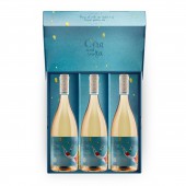
PRODUCTION / REALIZATION TECHNOLOGY: Label: The wine label was created with a coated paper with a special texture reminiscent of a fabric. The paper has a special treatment that makes it soft and silky to the touch to increase the tactile sensation of the product. Box: The package contains 3 bottles and recalls the label design. it is made with a cardboard covered with the same paper as the label and has a box opening. SPECIFICATIONS / TECHNICAL PROPERTIES: Label: 13,5x8,8 cm Box: 32x27x10 cm TAGS: wine, packaging, illustration, label design RESEARCH ABSTRACT: The research to develop the project was born from the inspiration for the famous book The Little Prince by Antoine de Saint-Exupery and his illustrations. The abstract and fairytale concept that inspired this work comes from here. Tell this wine, born from a dream, in a dreamlike and light way. The work to get to the final illustration went through several steps up to the final version which contains the main elements of the project. The goal is to create a unique and recognizable design capable of telling a story. CHALLENGE: The request was to create a label that would appeal to a target of wine lovers who seek in a wine not only the quality of the product but also a certain exclusivity and elegance together with elements of corporate and personal storytelling. Basically an audience of wine lovers looking for wine goodies produced by small cellars, with strongly territorial and identity characteristics. A target inclined to spend on quality products, which seeks a wine, beyond the purely qualitative aspect, also a side dish linked to the company and personal story of who produced that wine, as if to want to live the experience in holistic way. The goal was to create a highly expressive and personal packaging design that could tell a story related to the people behind this wine. ADDED DATE: 2020-07-05 08:51:56 TEAM MEMBERS (3) : Giovanni Murgia - Art direction, Sara Pilloni: Illustration and Bruno Haver: 3D bottle rendering IMAGE CREDITS: 3D Render: Bruno Haver Photography: Giovanni Murgia |
||||
| Visit the following page to learn more: https://bit.ly/2YY9vp2 | |||||
| AWARD DETAILS | |
 |
Cera Una Volta Wine Label by Giovanni Murgia is Winner in Packaging Design Category, 2020 - 2021.· Read the interview with designer Giovanni Murgia for design Cera Una Volta here.· Press Members: Login or Register to request an exclusive interview with Giovanni Murgia. · Click here to register inorder to view the profile and other works by Giovanni Murgia. |
| SOCIAL |
| + Add to Likes / Favorites | Send to My Email | Comment | Testimonials | View Press-Release | Press Kit | Translations |
Did you like Giovanni Murgia's Packaging Design?
You will most likely enjoy other award winning packaging design as well.
Click here to view more Award Winning Packaging Design.


