DESIGN NAME:
Wenext
PRIMARY FUNCTION:
Logo
INSPIRATION:
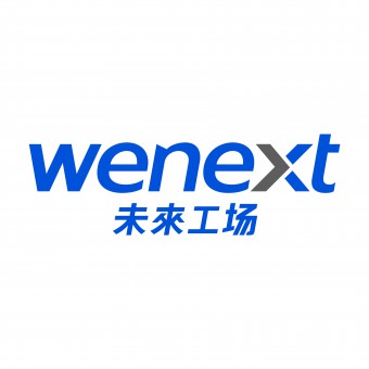
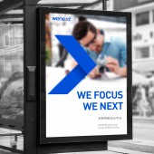
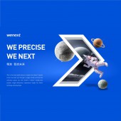
Adhering to WENEXT's special focus on precision technology, the font design of each tilt and spacing in the LOGO has been repeatedly polished to show the most comfortable visual effect. Make the color with a sense of future science English brand exclusive to our science and technology blue "and the next generation of gray". Product brand exclusive greater than symbol embedded in the letter 'X', is the brand fine and design visual integration of the United States.
UNIQUE PROPERTIES / PROJECT DESCRIPTION:
Wenext is a valuable internet manufacturing cloud platform that turns every customer's idea into a product to realize their product ideals. Wenext constantly discovers value, expands the value, and seeks new value in their cooperation. They focus on precision every time and create miracles at every point, line and plane. The world needs precision manufacturing of Wenext. Therefore, the greater than sign is used as the best representation of the Wenext brand.
OPERATION / FLOW / INTERACTION:
-
PROJECT DURATION AND LOCATION:
-
FITS BEST INTO CATEGORY:
Graphics, Illustration and Visual Communication Design
|
PRODUCTION / REALIZATION TECHNOLOGY:
-
SPECIFICATIONS / TECHNICAL PROPERTIES:
-
TAGS:
-
RESEARCH ABSTRACT:
-
CHALLENGE:
-
ADDED DATE:
2020-06-29 12:24:16
TEAM MEMBERS (1) :
IMAGE CREDITS:
Haihuai Zhu, 2020.
|


