Gallery Crossroad Exhibition Spatial Design by Hsin-Ting Weng |
Home > Winners > #107412 |
 |
|
||||
| DESIGN DETAILS | |||||
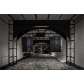
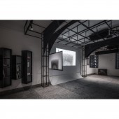
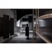
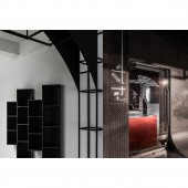
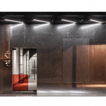
| DESIGN NAME: Gallery Crossroad PRIMARY FUNCTION: Exhibition Spatial Design INSPIRATION: Gallery Crossroad is a culture hub for photography lovers. The name, crossroad, came up from the occasion where every ordinary man makes decisions on a daily basis, implying how photographers gaze and their decision of pressing the shutter. Image is composed of how the photographer conducts framing on viewfinders every moment; however, how it will be interpreted with extended comments based on the perspective and self-experience of observers themselves. UNIQUE PROPERTIES / PROJECT DESCRIPTION: The site was a dilapidated Taiwanese residential abode built 40 years ago. The exterior grafted textured checkerboard to renew the dotage of building with modern touches. Whereas in the interior, the steel wireframe structure, seen alongside from columns to ceilings, is functional for hanging pieces, and its arch form visually extends the building depth, suffusing with unreal impressions. OPERATION / FLOW / INTERACTION: A semi-clear screen made by hollow boards, separating the information /reception desk from the gallery area. The translucent properties suffuse an indistinct glow resonant with surrealist ambiances; whereas, the old, existing, red door and grid tiles on wall are intentionally kept intact, creating a perceptual contrast and recalling the vicissitudes of times. PROJECT DURATION AND LOCATION: Started from October 2020 and finished in February 2020. Taichung city, Taiwan FITS BEST INTO CATEGORY: Interior Space and Exhibition Design |
PRODUCTION / REALIZATION TECHNOLOGY: To cater for unknown images and art pieces in the future, the gallery area is filled with voids and set in achromatic color schemes. The minimalism form of contour is delineated only by light. Through different angles of framing, the shadow itself comes along with dark tonal effects, sustaining dynamic movement, building up layers of geometric arrays, and increasing the illusion of volume. SPECIFICATIONS / TECHNICAL PROPERTIES: Construction area 60 square meter. TAGS: Photography, Exhibition Space, Multi-functional Space for Public, Steel Tubes, Checkerboard, Cyclorama Wall, Minimalism, Red, Achromatic Colors, Complementary Colors RESEARCH ABSTRACT: Photography involves light and framing; thus, the interior gallery space avoids daylighting interruption by blocking most exterior windows at the storefront, creating an impactful perception to viewers. CHALLENGE: In order not to interfere with the independent thinking made by observers, the cyclorama wall, which can be seen both at the storefront and inner gallery space, diminishes accessibility and allows people to view the full frame. ADDED DATE: 2020-06-28 14:55:56 TEAM MEMBERS (2) : Hsin-Ting Weng and Lexie Tsai IMAGE CREDITS: YHLAA PATENTS/COPYRIGHTS: Copyrights belong to Ris Interior Design Co., Ltd.. |
||||
| Visit the following page to learn more: http://ris-interior.com/ | |||||
| AWARD DETAILS | |
 |
Gallery Crossroad Exhibition Spatial Design by Hsin-Ting Weng is Winner in Interior Space and Exhibition Design Category, 2020 - 2021.· Press Members: Login or Register to request an exclusive interview with Hsin-Ting Weng. · Click here to register inorder to view the profile and other works by Hsin-Ting Weng. |
| SOCIAL |
| + Add to Likes / Favorites | Send to My Email | Comment | Testimonials | View Press-Release | Press Kit |

