Curridabat Ciudad Dulce Place Branding by Fabrizzio Mendez |
Home > Winners > #107169 |
 |
|
||||
| DESIGN DETAILS | |||||
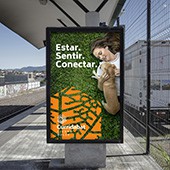
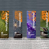
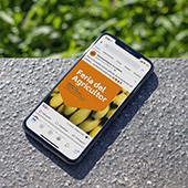
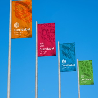
| DESIGN NAME: Curridabat Ciudad Dulce PRIMARY FUNCTION: Place Branding INSPIRATION: Ciudad Dulce (Sweet City) is a methodology based on nature; its purpose is to promote a positive experience for all citizens, by seeking inspiration in nature. Thus, it is from that inspiration that this flexible brand arises; it is built from shapes in repetition, patterns, organization, and structures present in the natural environment. These can be found in something on a large scale, such as city topography, or something as small as the veins in a leaf or a fingerprint. UNIQUE PROPERTIES / PROJECT DESCRIPTION: Just as nature uses principles to function, develop and organiztion, a city can also use these principles to create community and develop. With this idea in mind, we chose aspects of harmony, organization, and logic that can be found in nature; such as fractal geometry, symmetry, spirals, stripes, fractures, etc. In the end, we chose the patterns of nature which show a coherent and organized growth. This reflects the methodology of Curridabat Ciudad Dulce. We also decided that the brand should be flexible so that it can express the diversity of the city's audiences and activities. OPERATION / FLOW / INTERACTION: The vision of development in Curridabat Ciudad Dulce is part of the creative and generative logic of nature. This logic is reflected in everything the brand does to reach the diversity of the citizens. The hexagon patterns visible on all physical and digital graphic materials, outdoors, buildings, public furniture and more, make it easy for audiences to live the universe of the brand. PROJECT DURATION AND LOCATION: This project was developed in the city of Curridabat, in Costa Rica. It started in July 2018 and ended in April 2019. Since then, it has worked together with the local government of Curridabat to expand other derivative projects and to accompany them in the process of brand implementation. FITS BEST INTO CATEGORY: Graphics, Illustration and Visual Communication Design |
PRODUCTION / REALIZATION TECHNOLOGY: Once the essence of the brand is defined– which serves as the basis of the project – a divergent creative exercise is made to capture relevant ideas and visuals, which will then be tested and filtered in another convergent exercise, from which 3 different creative paths that work are defined. Finally, the most suitable one is chosen to meet the objectives of the brand. The Adobe Creative Cloud design tools were used for final realization. SPECIFICATIONS / TECHNICAL PROPERTIES: The use of circumscribed hexagon-shaped patterns of nature (as in beehives) is the axis on which the visual system is supported, which will facilitate the identification and differentiation of the brand in all graphic materials with which audiences interact. TAGS: Curridabat, Ciudad Dulce, Branding, Costa Rica, Place Brand, Kerigma Branding, Flexible Brands, City Brand RESEARCH ABSTRACT: Several in-depth interviews were conducted with key people in the local government. We review various demographic studies of the city, as well as documentation explaining the vision of Ciudad Dulce. We carried out an audit of the graphic materials and communicative efforts that had been used; also, we analyzed aspects of the city and its people, among other things. All this to fully understand the essence of the brand. The objective was to define a brand that adequately reflected the innovative vision that the city had been successfully implementing for several years. This defined the essence of the brand, the differentiating attributes, the values, the archetype of personality of the brand and its main purpose. From here, the design of the logo and the rest of the visual system continued. CHALLENGE: The challenge was to build a visual system that reflects a city that cares about the well-being of its inhabitants, not only humans, but also non-humans, such as pollinators (bees, butterflies and hummingbirds), as well as plants and trees, along with all other organisms, which are recognized as citizens. This new identity should reflect that the vision of development is inspired by nature, with a balance between the rational-scientific and the emotional-holistic elements. In addition, it had to be flexible enough to support the diversity of programs, projects and activities that different audiences interact with. ADDED DATE: 2020-06-26 22:51:49 TEAM MEMBERS (6) : Fabrizzio Mendez, Yesenia Salazar, Carolina Carrillo, Jeisson Sibaja, Gabriel Jimenez and Beatriz Aguilar IMAGE CREDITS: All photographs by Fabrizzio Mendez |
||||
| Visit the following page to learn more: https://bit.ly/2NxkfnU | |||||
| AWARD DETAILS | |
 |
Curridabat Ciudad Dulce Place Branding by Fabrizzio Mendez is Winner in Graphics, Illustration and Visual Communication Design Category, 2020 - 2021.· Press Members: Login or Register to request an exclusive interview with Fabrizzio Mendez. · Click here to register inorder to view the profile and other works by Fabrizzio Mendez. |
| SOCIAL |
| + Add to Likes / Favorites | Send to My Email | Comment | Testimonials | View Press-Release | Press Kit |

