DESIGN NAME:
Glamorous Uniformity
PRIMARY FUNCTION:
Residence
INSPIRATION:
The designer emphasizes on uniformity and simplicity in its structural outlines and texture selection, creating sense of elegance without having to be lavishly extravagant. Also, it integrates both bold and soft materials into the design, representing the couple of two different characteristics and preferences blend perfectly together.
UNIQUE PROPERTIES / PROJECT DESCRIPTION:
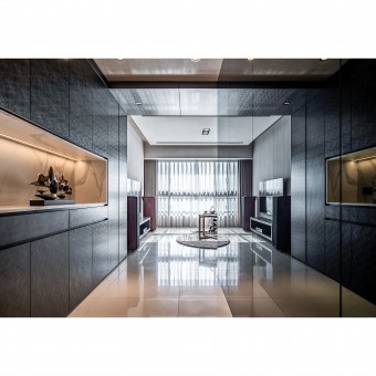
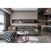
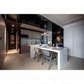
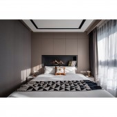
The entrance of the house begins with a dark metal wall of cabinets on the left, extends way up to the ceiling along the aisle, creating a sense of flow across all major sections of the home. A white marble niche is embedded in the middle of the metal wall, adding a noble taste and as a teaser to the main character of the home: the luxurious white marble kitchen island. Walls in public areas are in lighter beige tone connected to the bright shades of floor tiles, while the wallpaper and cabinets are in fabric textures in coherence with the grand fabric curtains to enhance the sense of uniformity in its overall design.
OPERATION / FLOW / INTERACTION:
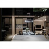
The original layout configuration has been greatly changed. The design team connects the living room and kitchen with an open design method, adding more storage design in the public and private areas to optimize the functionality in the limited space. In the project, the environmental awareness is expressed in the selection of materials, wooden materials are chosen from manufacturers with trees replanting plans, and the cabinets too are made of low formaldehyde materials. LED lighting are selected for their energy-saving nature, hanging above the dining table to create spacious atmosphere and also as the visual attractions to the space.
PROJECT DURATION AND LOCATION:
The project finished in August 2010 in Taichung, Taiwan.
FITS BEST INTO CATEGORY:
Interior Space and Exhibition Design
|
PRODUCTION / REALIZATION TECHNOLOGY:
Japanese HDP High Density Printing metal plate, melanin board, white marble stone, modular cabinets with surface of fabric texture, , fabric texture wallpaper, black mirror, polished quartz floor tiles
SPECIFICATIONS / TECHNICAL PROPERTIES:
The area of this project is about 81 square meters. The original layout was with 3 standard bedrooms, 2 bathrooms, a dining room, a kitchen and a living room. After the rearrangement, the layout combines two bedrooms into one sizeable master bedroom with a dressing room in it. Besides, it also turns the originally separated kitchen and dining room into a spacious open kitchen and dining hall.
TAGS:
Uniformity and Simplicity, Contrast and Fusion, Warm and Cold Colors Bold, Soft materials
RESEARCH ABSTRACT:
If life is a movie, home is the scene of the story. The designer takes the resident as the main character and the space as the supporting role as the main direction of the script, with the dark color that the newlywed husband loves as the main tone, supplemented by the earth color of the wife favorite, thus injecting a warm flow into the cold tonality. The color and material of the entire space coexist with both rigidity and softness. The designer gives the space a new definition by rearranging the existing layout of the original house and blends it with the life visions of the young couple.
CHALLENGE:
In order to overcome the limitations of the modular cabinets in its workmanship and surface material selection, the designer combines both modular furniture with carpentry woodwork, by using modular cabinets as the base of the furniture, and carpentry in the external. This allows the use of metallic texture High Definition Printing wooden board as the surface to add maintainability besides adding exquisite appearance to the furniture. The combination of workmanship has imposed complexity to the process that could not have been accomplished without ample professional skill.
ADDED DATE:
2020-06-24 08:25:19
TEAM MEMBERS (1) :
JUNG CHI HSU
IMAGE CREDITS:
Unispace Interior Design Studio
|
